Revitalizing a charity that trains surgeons in conflict & catastrophe.
David Nott Foundation
Freelance Product & Graphic DesignER • Brand ambassador
Sep 2023 – present
Photo: Lucy Lyon
Background
Five billion people worldwide lack access to safe, skilled surgical care. Healthcare can be stretched to breaking point by conflict and catastrophic events, like earthquakes or floods.
When volunteering his trauma surgery skills at times of urgent need in Syria, Nepal and beyond, Co-Founder Professor David Nott started teaching at the end of his days operating. He shared decades of knowledge with frontline doctors, equipping them with the confidence and life saving skills.
Built on David’s 30 years of frontline experience, the foundation trains medical professionals to become skilled surgeons that save more lives in countries impacted by war and catastrophe.
The brief
To highlight David Nott Foundation’s refreshed mission, impact, values and story through:
A new brand identity that feels urgent, inspiring, impactful and hopeful
A suite of new icons
A new website UI with the aim to improve engagement and navigation
Digital marketing assets including a social media library, email template and presentation deck
Print materials including posters, pull-up banners and office vinyls
A set of brand guidelines to help improve content consistency
Brand launch campaign assets including videos and social media posts and stories
Audience
Primary audience
The David Nott Foundation’s primary audience consists of an older age group (60+) who are morally driven by their cause or passionate about supporting vulnerable communities. They are predominantly well-educated professionals with a significant cohort from the medical world or faith groups. They also commonly support other humanitarian organisations such as the Red Cross, MSF, UNICEF and Amnesty International.
Many of our donors found out about us through mixed media (print, TV and radio), David Nott’s book, War Doctor, or listening to David’s interview on BBC Radio 4’s Desert Island Discs.
Secondary audience
The foundation’s secondary audience is a younger age group (18-25), primarily consisting of medical students interested in David Nott’s work or becoming humanitarian surgeons in the future.
“We want our brand to feel alive, inspiring, hopeful and appealing to younger donors, human rights activists and humanitarians, which we hope this project will support.”
Brand identity
After speaking to the team about their key audiences and analysing competitor brands, I developed and presented three brand routes to the team. I implemented their feedback and arrived at the following concept.
Brand concept: Leaf
The concept drew inspiration from three key words referenced in the brief: trusted, reliable, grounded.
I contrasted a fresh, modern pale green (symbolising land, growth and peace) with a rich, elegant dark blue (representing the sea, trust and authority) for visual impact.
concept Inspiration
Typography
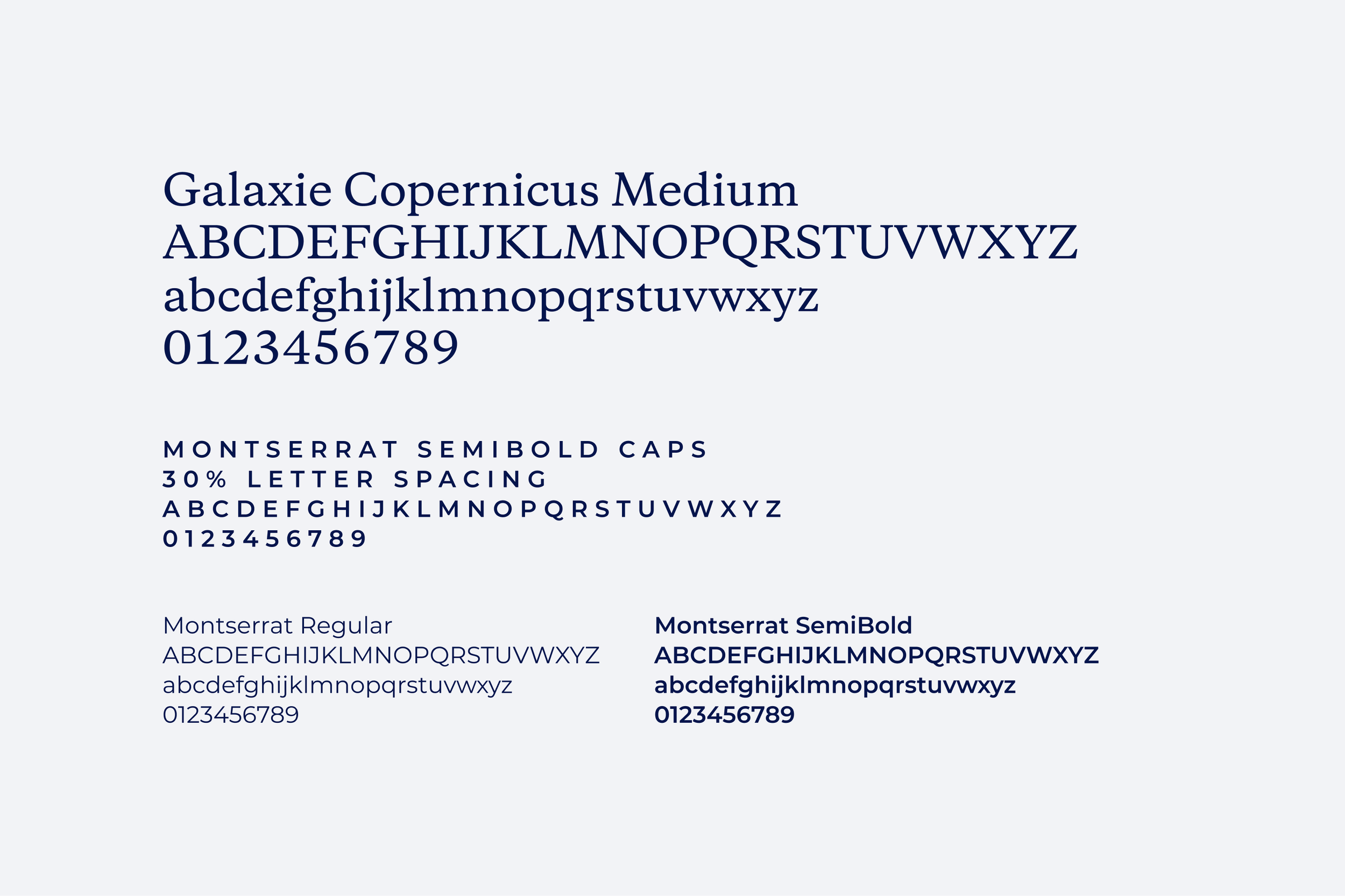
I proposed contrasting Copernicus, a striking, bold font with Montserrat, a clean, modern font that looks great in caps.
Logo design
The foundation wanted to keep the signature part of the logo so I centrally aligned the ‘Foundation’ text in the chosen font styling.
Colour palette
Icons
A suite of icons to be used on the website, emails and presentations. A selection of my favourites are shown below.
Map motif
The map motif is used across all brand assets; an interactive version is featured on the foundation’s website.
Website UI
I designed the foundation’s website which includes the following key features:
A descriptive meganav for easy navigation across the site
An interactive map that highlights where the foundation works, linking to further information and articles
An interactive sliding scale that allows users to visualise the difference their monetary donation could make
Donation functionality that is simple, engaging an easy to navigate
A latest news area that allows users to filter articles and videos by operating zone, operating country, course type and author
A quick and easy way to sign up to the foundation’s newsletter
A showcase of the cutting-edge teaching technology adopted by the foundation
Map graphics for each operating country webpage
Homepage
Course page
Country page
Article page
Meganav
Digital marketing assets
Social media library
I created a comprehensive social media asset library featuring editable, auto-layout templates in Figma and Canva.
I designed posts, stories, banners and display images for Instagram, Facebook, Twitter and LinkedIn. A selection of the Instagram posts are show below.
Email template
Furthermore, I designed a refreshed editable, auto-layout email template to match the new website.
Presentation deck
I also created a presentation deck including a library of master slides for internal and external meetings.
Brand guidelines
I provided a set of brand guidelines to help improve content consistency across the organisation.
Print materials
Posters
Pull-up banners
Business cards
Our map motif highlights the location of each staff member.
Office vinyls
Brand launch campaign
To complement the brand development project, I was briefed to support on a branch launch campaign. I supplied:
A mood board of recent competitor campaigns
Social media posts and stories for Instagram, Facebook, Twitter and LinkedIn
'Our story' story board and video
'Three pillars' story board and video
I presented four campaign concepts and we developed two of them. I collaborated with Videographer Ollie Holder to bring the story boards to life.
Concept 1: It’s not about…
‘It’s not about…’ builds upon a quote by David Nott and really showcases the people whose lives and helped and saved by the charity.
Concept 2: What it takes
‘What is takes’ is inspired by all the incredible people behind the David Nott Foundation and uses the charity’s three pillars as a base:
building capability
Training courses
Anaesthetists
Nurses
HESTON
building community
Runners
Bakers
building awareness
FDNF student societies


