
LiveSmart website UX/UI
Background
LiveSmart provides remote, digital-first health MOTs and one-to-one health coaching to help businesses feel happier and healthier.
As a B2B product, LiveSmart have two main user types: buyers (HR professionals) and end-users (employees).
LiveSmart operates in the UK, France and Malaysia.


The brief
To redesign LiveSmart’s website and support business growth by improving the content, navigation, and tone of voice. The key aim is to better communicate to HR professionals – our primary audience for this project – the reasons why their company should invest in a LiveSmart health assessment.
The website redesign is a major part of a wider initiative to improve our brand positioning.
I formed part of a working group consisting of LiveSmart’s Head of Product, members of the Clinical, Technology and Service Delivery teams, a Brand Consultant and a Copywriter who specialises in health innovation products.
Goals
Business goals
To develop and communicate our brand positioning in order to increase trust in LiveSmart
To increase the percentage of HR professionals that request a free product demo
To increase sales and support business growth
To increase the percentage of staff uptake at company rollout
User goals
HR professionals (primary users)
To understand what LiveSmart is and what the benefits of using it are
To understand the differences between LiveSmart’s health assessments
To understand whether LiveSmart fits their budget, preferences and company objectives
Employees (secondary users)
To understand whether LiveSmart fits their needs and preferences


Journey mapping
Below is a journey map that identifies the stages of the end-to-end LiveSmart experience for HR professionals, our primary audience for this project. The Product team used sticky notes to map key user activities, delights and problems.
The website redesign aims to make the ‘Find out about LiveSmart’ stage as delightful as possible for our customers.
The top four pain points
What we know about the current website designs from previous user and business feedback:
brand POSITIONING
LiveSmart doesn’t have a tone of voice guide and our current brand messaging is poorly crafted for our different user types: buyers (HR professionals) and end-users (employees). We are unclear about who we are speaking to through our website and this makes us feel untrustworthy.
Navigation
Over time, new webpages have been introduced for our different user types. However, full reviews of the website’s overall content and design were not completed at each stage and so navigation has become muddled.
Additionally, it is not possible to navigate from our UK site to our French and Malaysian sites which had led to a disjointed user journey.
Explaining health assessments
Currently, the way we communicate the differences between our health assessments is poor and doesn’t align with what matters to our audience. Right now, we use blood readings as a way to differentiate our products – but our audience doesn’t understand or need this information at the early stages of their purchase journey.
customer stories
Our existing website lacks a variety of engaging, data-backed case studies. We know that hearing from other companies – as well as their staff members – about their experience using LiveSmart is highly valued by both our audiences.
Existing UI designs


Interviews with HR professionals
LiveSmart has two main user types: buyers (HR professionals) and end-users (employees). Previous user research and data analysis have given us an in-depth understanding of our end-users – but there are still large gaps in company knowledge around our buyer audience.
To expand this knowledge, I started by interviewing five senior HR professionals from different sectors via Google Meet.
Interview aims
The aim of the interviews were to understand:
when and where HR professionals look for new health and wellbeing benefits
what motivates them to purchase health and wellbeing benefits
their company sign-off process
what sources they use to find the latest HR news and information


Top five findings
When researching new health and wellbeing benefits, participants most commonly search for ‘health and wellbeing initiatives’ or similar on Google. They also seek advice from HSE, CIPD and specialist HR consultancies, as well as local LinkedIn networks including London HR Connection and Corporate and Cocktails. In reference to this, one said, “I want to know that somebody else in my position thinks it’s good; that they’re taking it up and advocating it.”
Companies look for new health and wellbeing opportunities at various times throughout the year. Some wait until their busy season is over, while others wait until they review their budgets and T&Cs.
Purchase decisions are led by both the well of their staff and their business. Inclusivity is really important – they want to offer benefits that work for all staff.
All participants were responsible for researching, proposing and implementing health and wellbeing benefits. They would commonly need to present to the Leadership team (in financial terms) for final sign-off.
The most popular sources of HR news and information are CIPD, Disrupt HR, XpertHR, People Management Magazine, Sage HR, HR Magazine and Grapevine.
The above findings were presented to the Sales and Marketing teams for further investigation.
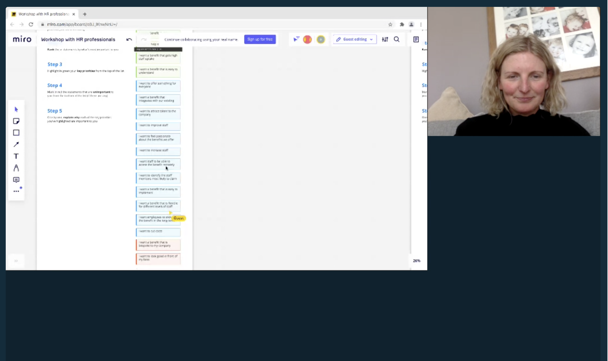
Prioritisation workshop with HR professionals
In order to further understand our buyer audience and their motivations, I ran a remote prioritisation workshop with 15 senior HR professionals using Miro and Lookback.
Workshop aims
The aim of the workshop was to:
validate or disprove the assumptions LiveSmart holds about their buyer audience
identify what HR professionals want from a staff health and wellbeing benefit
Methodology
Participants read through a list of 20 statements and added any they felt were missing (this list was developed in a value proposition workshop with the Head of Product and our Customer Success Manager who works closely with this audience)
They ranked them in order of priority
They highlighted their key priorities in green
They marked the statements that didn’t matter to them in red
We discussed each green and red statement in more detail


Key findings/top three priorities
1. I want to improve staff health and wellbeing
90% of participants said that improving their staff’s health and wellbeing was their number one priority. Many referenced the impact of the pandemic and how much more important health and wellbeing has become as a result. One said, “it's about having a happy, productive working environment. To get the most out of people it's about creating a good working culture and supporting staff through blips i.e. covid. We want staff to feel we look after them – it's part of being an employer of choice.”
2. I want to feel confident that the benefit will make a difference
Participants want reassurance that the health and wellbeing benefit will positively impact staff – and want to see data and case studies to prove it. They want to ensure that their financial investment will pay off and make a difference to all staff.
3. I want a benefit that is easy to understand
Participants want a benefit that is easy to understand for both the business and their employees. They emphasised the importance of accessibility as their workforces were made up of a diverse range of ages, backgrounds and levels: “it has to work for everyone”. They feel that if the benefit is easy to understand, it will ultimately result in more sign ups and higher staff engagement. One said, “it's really important that staff and the business understand it: what are they signing up for, what will it cost and how much will it benefit them?”
Empathy mapping
The Product team then facilitated an empathy mapping exercise using Miro in order to capture findings from the above interviews and workshops, as well as the working group’s combined customer knowledge. Together we mapped out user attitudes, behaviours, needs and pain points for our two core audiences, and grouped them into categories to help identify emerging themes.
Persona 1: HR Director
Persona 2: Employee
Personas
The above empathy mapping exercise was then used to inform our two main user types. These profiles will be used as a reference at every stage of this project and future LiveSmart projects.
Persona 1: HR Director

NAME: Jane
AGE: 42
JOB: hr director
LOCATION: London
LiveSmart FAMILIARITY: LOW
“I want to offer a health and wellbeing benefit that will make a difference to all staff.”
BIO
Jane works as an HR director in a corporate head office. She works between 8.30 and 17.00 and manages six other HR professionals.
BEHAVIOURS
Jane is responsible for her company's benefits offering and is the head decision maker when it comes to the HR department's budget. Health and wellbeing is just one of her many areas of responsibility and she juggles multiple tasks every day.
FRUSTRATIONS
Jane wants to support the whole company with their health and wellbeing but budget is limited
Work can be overwhelming at times. Her time and attention is constantly divided between important tasks that require a lot of focus
GOALS
Jane's aim is to help create a safe and happy workplace. She wants to offer her staff health and wellbeing benefits they will actually use and like, and feels good when her staff respond well to them
She wants to offer a benefits package that is on par with companies that are competing for talent. Her ultimate goal is to achieve high job satisfaction and staff retention across the company
Many staff work remotely and so benefits need to be flexible and accommodating
Jane would like to avoid additional admin and decision-making
Persona 2: Employee

NAME: GEMMA
AGE: 32
JOB: Lawyer
LOCATION: MANCHESTER
LiveSmart FAMILIARITY: LOW
“I want to feel good and have more energy.“
BIO
Gemma is a lawyer for a global corporate company. She is career-driven and understands that a healthy body and mind is conducive to good work.
BEHAVIOURS
Gemma considers herself pretty healthy but knows she could do more regarding diet and exercise. A busy work and social calendar make it difficult for Gemma to prioritise her health and wellbeing as much as she would like.
FRUSTRATIONS
Her busy schedule means that she often feels tired and lacking in energy
She often lacks motivation to exercise during the working week, particularly during the colder months
GOALS
Gemma wants to feel good and have more energy
She wants to maintain her fitness and lose some weight
She would like to know whether she has any underlying health issues or whether she's at risk of developing health issues in the future
When it comes to her health, she would like a push in the right direction, but hasn't considered speaking to her GP as that feels like too big a commitment
Competitor analysis
I used Miro to review various competitors’ websites, focusing on their product offering, tone of voice, and primary CTAs. These included Headspace for Work, Unmind, Thriva and Perkbox.

Headspace for Work’s primary CTA is to get a demo
Modern and engaging illustrations are used to promote downloadable resources
Swipe to view more work-related resources
Phrases like ‘tailored’ and ‘the solutions and services your team needs’ emphasise the flexibility of their program offering
A checked list highlights the key features of each program: Foundational, Guided and Advanced
Positive, succinct titles are used to explain the product
Their primary CTA is used repeatedly across Headspace for Work pages

Unmind use stylised illustrations to visualise the product
Clear, concise language is used to summarise their offering
Their primary CTA is to book a demo
Unmind will support businesses with staff uptake and engagement
Pull-out stats have been used across the website to highlight impressive data
They’ve developed a tool to helps businesses understand the impact of mental health issues in the workplace

Thriva’s primary CTA is to take a quiz that helps users build a personalised blood test. The quiz ask users which areas of health they would like to focus on: long-term health, energy, sleep, mood, fitness or weight. They then ask which goal is most important to them and why
The approachable language used across the site makes the product sound simple and easy to use
Simplified illustrations of their UI help users visualise the product
Phrases like ‘NHS approved lab’ and ‘personalised GP report’ add legitimacy. ‘In under 48 hours’ emphasises the convenience of the service
Photos of the team add a human touch. The container shape reflects Thriva’s logo
Each blood test clearly explains the aspects of health they relate to with accompanying icons
All medical copy is purposefully written in a language that is accessible to all users

Perkbox’s primary CTA is to request a demo
Each featured case study clearly summarises client information
The products purchased by the client are also listed here
Three key results are promoted, with a clear timeframe of when they were achieved by
Client quotes have been pulled out of the main text and are accompanied by the organisation’s logo
Users can download a summary of the case study to share with their team
Perkbox offer a wide range HR-specific resources including books & guides, events & webinars, blog articles and videos
Brand development
After gathering insights about our user types, LiveSmart began a brand development project to refine our brand positioning in a way that aligns with what customers really want.
I formed part of a working group consisting of LiveSmart’s CEO and Head of Product, a Brand Consultant and a Copywriter who specialises in health innovation products to help develop the new brand positioning and communicate updates to the wider organisation.
Health analytics
This is what we do.
Career-driven professionals who want to be great at what they do
This is who we do it for.
Greatness starts with great health
This is why we do it.

Bring health analytics to life with data.
The data can be visually supportive of an individual by being behind or underneath them.

No to hard-bodied superhumans. No to terribly staged office shots.
Yes to realistic people trying hard and enjoying it. Yes to people that feel like they’re excited about being at work.
Usability testing round one
In order to validate the first draft website designs, I facilitated usability testing sessions with five senior HR professionals using Lookback and a high-fidelity Figma prototype.
Testing scenario
“The CEO of your company has asked the HR department to research health assessments for your company. Use this website to find out if this is the right one for you.”
Testing aims
To understand whether our new brand positioning resonates with participants
To see whether participants understand the benefits of using LiveSmart
To understand whether splitting B2B, B2C and partner experiences makes for a better user experience
To see whether participants understand the difference between our products, whether we’ve provided the right amount of detail about each product, and whether these details matter to them
To see whether participants would be intrigued to find out more
To understand whether users understand the benefits of health coaching
To understand whether our new navigation matches their mental model

Click to see the prototype


Top five findings
Users didn’t know whether we were speaking to them or someone else
Users didn’t understand the why. What does it mean for me? So what?
Users were very interested in a tailored package/flexibility
Users really value hearing HRD case studies with data to back it up
Users are detailed-oriented – they want to gather as much (data-driven) information as possible before making a decision or before speaking to a colleague/manager about LiveSmart
Key recommendations
Review homepage CONTENT, specifically the hero section
When users landed on the site, what they initially saw didn’t resonate with them. Users didn’t understand what was in it for them – “there’s no ‘so what”.
Review the nav
Users found it difficult to understand who we are and what we do without doing a lot of digging. Plus ‘Insights’ in the nav did not match expectations and caused frustration.
Introduce an ‘About us’ page
Users expected to see an ‘About us’ page for information about our vision, why they should choose LiveSmart and the people behind the company.
Introduce case studies
Create a data-backed case studies page to help explain the benefits of LiveSmart. Users expected to see this information on our site and really valued it.
Update the HEALTH ASSESSMENTS page
Test without Premium and Prepare as these packages didn’t resonate with users. A tailored package was very attractive to users so we will test giving a tailored package it’s own product card.
Usability testing round two
After addressing the recommendations from testing round one, I facilitated five more usability testing sessions with HR professionals using an updated prototype.
Testing scenario
“The CEO of your company has asked the HR department to research health assessments for your company. Use this website to find out if this is the right one for you.”
Testing aims
To understand whether our new brand positioning resonates with participants
To see whether participants understand the benefits of using LiveSmart
To understand whether a more focussed B2B experience makes for a better user experience
To see whether participants understand the difference between our products, whether we’ve provided the right amount of detail about each product, and whether these details matter to them
To see whether participants would be intrigued to book a free demo
To understand whether additional, dedicated pages for the health questionnaire, blood collection, health report and client benefits would be beneficial for users
To understand whether our navigation matches their mental model

Click to see the prototype


Top 5 findings
On average, users rated the site 8/10 in terms of usefulness. All users found the information they were looking for and the messaging resonated with them. One said, “when you’re thinking about a product, it makes a big difference if the site is user friendly and easy to understand, which this definitely is. It’s very specific”
Our brand positioning resonated with all users. One said, “there’s lots of good information. It’s modern and how I would want to see a website these days. There’s not too much text and a nice way of presenting data – I really like it”
All users clicked ‘Book free demo’. And messaging around booking a free demo could be prioritised even further
All users clicked on links to at least two of the newly proposed pages (health questionnaire, blood collection, health report and client benefits)
Some of the ‘What’s great about…’ reasons on the product cards were not resonating. Replace these with more specific benefits for employers and their employees
Key recommendations
Create video content to explain each area of the product
These videos will give us the opportunity to go into more detail about each area of the product and answer employee-specific questions that were raised around data anonymity, how the product looks and how easy it is to use.
Update the ‘What’s great about…’ COPY
Update the ‘What’s great about…' copy on the product cards.
Create content for at least FOUR case studies
Users found the data-backed case studies really helpful in regards to decision-making.
FURTHER Promote OUR free demo
…However, users found the pages very clean and clear so be wary of overwhelming them with this information.
UI designs
The Figma design files and exported image files were then handed over to LiveSmart’s Front-End Developers in order to build Angular components. I adapted various graphics for our French and Malaysian sites, to better reflect our audiences.


