brand identity, UX/UI & marketing materials
Background
Everge is the ultimate positive parenting app, packed with science-backed tips, tricks and training courses from parenting experts in communication, nutrition, sleep and more.
With its head office based in Amsterdam, the Everge app is available in Dutch and English.
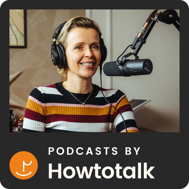
Howtotalk
The Co-founders of Everge also own a parenting communication company called Howtotalk. Howtotalk helps parents strengthen the bond with their children by teaching them gentle and respectful communication methods.
After delivering over 50k in-person training courses to parents and educators and selling over 110k books, they decided to launch a Howtotalk app to share their expertise more widely.
Everge is an expansion of the Howtotalk app, which features Howtotalk’s communication training courses and techniques alongside parenting advice from other experts around the world. We used a phased approach to transition from the Howtotalk app to the Everge app.


The brief
To design the Everge product, including:
A complete brand identity
The UX/UI of the Everge app
A marketing website that allows users to subscribe to the Everge app
Digital marketing assets including flexible social media, paid ads and email templates
Business assets including pitch decks for potential investors and partnering parenting experts
I formed part of a small, cohesive team consisting of Everge’s Co-founders (Head of Product and Chief Content Officer), a Product Content Manager, a Copywriter and two Developers.
User interviews
In order to understand our key audience, their motivations and challenges, the team held interviews with 15 parents via Teams.
Top 5 findings about our audience
The main motivations behind learning new parenting techniques were to strengthen the bond with their children, to promote autonomy and to create a stable, respectful home environment. One said, “I want my children to be heard and valued.” On a more intrinsic level, many interviewees were motivated by their own personal growth
80% of interviewees had more than one child. Interestingly, parenting techniques that were successful with their first child did not work well with their subsequent children. One said, “With my first child, everything went well, but suddenly my standard method stopped working with the second and third child." They recognised that each individual child is unique and requires a different approach but were unsure how to go about it
Parents actively seek out new parenting techniques when their existing methods are no longer working for them or when their children reach a more challenging developmental milestone e.g. hitting or kicking during a tantrum
Multiple interviewees stated that positive parenting is important to them because they had childhood challenges that led to difficulties later in life: “Negative emotions were not fully acknowledged during my upbringing – I wish it had been different. I aim to give my son the tools to become a kind and empathetic individual who can handle others' emotions.”
The biggest challenges for parents around learning new parenting techniques is lack of time, tiredness and feeling overwhelmed. Therefore the techniques need to be accessible, simple and easy to apply


The existing Howtotalk app
UI designs
The existing Howtotalk app was designed by The Mobile Company in Dutch and English.

Top pain points when using the Howtotalk app
The team also spoke to the interviewees about their experience with using the Howtotalk app.
Search
Participants expressed difficulties in locating specific content within the app due to the limited search functionality. As Everge will cover various parenting topics, implementing a more advanced search feature is a priority.
Free vs. paid for content
Users were uncertain about which content was free and which required payment. Some didn’t realise that there was any free content available on the app and hoped to try out some of the training materials before committing to a subscription. One said: “I hoped there would be a trial period to explore the content before making a purchase.” There was also confusion around the terms ‘lifetime subscription’ and ‘Howtotalk Plus’.
content is not tailored
Users stated that they would like to see training suggestions based on their interests and the age of their children so that the content feels more relevant to their family set-up and the current developmental milestones their children are facing. Some raised concerns about their child’s privacy so it would be useful to offer reassurance around this in the app onboarding.
social sharing
Users would like to share content with their partner, friends and family through the app. One said, “I would like to invite my pregnancy group to use it together. I use a sports app with a similar system and it encourages me to use it more often.”
Empathy mapping
The team then facilitated an empathy mapping exercise using Figjam in order to capture findings from the above interviews. Together we mapped out user attitudes, behaviours, needs and pain points for our core audience, and grouped them into categories to help identify emerging themes.
Personas
The above empathy mapping exercise was used to generate our key persona. The profile was used as a reference point throughout this project and will be used for future Everge projects.
Key persona: mother of three

NAME: AVA
AGE: 36
JOB: part-time teacher
family: married with 3 children under 10
LOCATION: amsterdam
“As a time-strapped parent, I strive for parenting strategies that effortlessly weave into my daily routine”
BIO
Ava is a part-time teacher and mother of three young children aged nine, six and two. Her part-time job as a teacher reflects her passion towards the wellbeing of children.
BEHAVIOURS
Ava is keen on personal growth and is open to trying new positive parenting methods with her children. She follows various parenting experts on Instagram including Howtotalk and Big Little Feelings.
challenges
Ava struggles to balance work, her parenting responsibilities and household tasks. There’s always a lot to do in limited time
Her two-year-old is currently approaching the toddler stage and has started testing boundaries (and her patience) which can feel frustrating at times
While Ava’s husband is open to new parenting approaches, he doesn’t actively seek out guidance which can leave Ava feeling overwhelmed in her efforts
GOALS
Ava’s core aim is to better understand the needs and feelings of her children in order to strengthen their bond. She wants to create a positive, nurturing environment at home
She is keen to encourage a more active involvement and joint exploration of positive parenting techniques with her husband to create a more cohesive home environment
Ava aims to develop emotional resilience and coping strategies to handle challenging parenting phases such as her two-year-old’s boundary-testing
She would like access to simple, practical parenting techniques that easily fit into her busy routine
Competitor analysis
Throughout the project, the team and I carried out thorough reviews of competitor apps and e-libraries. We focused on training screens, personalised home screens, search functionality, tone of voice and overall UI. These included Masterclass, Duolingo, Peanut, Spotify and Netflix.

The home screen is divided into ‘Home’ and ‘My list’, which allows users to bookmark learning materials
MasterClass uses clear, succinct copy to explain the product. The term ‘instructors’ is used to describe course leaders
MasterClass’s primary CTA is to ‘Get all-access’
Just three rows are displayed on the home screen: ‘New Classes’, ‘Class Previews’ and ‘You May Also Like’ which lists instructors and their areas of expertise
Class thumbnails include the instructor’s area of expertise, their name and the class title (truncated)
There are just two items in the nav: ‘Home’ and ‘Library’ (search)
Key class information: the instructor’s area of expertise, their name and the class title
The default CTA is ‘Play lesson 1’ which updates in accordance with the user’s class progress
There is a clear breakdown of each lesson which includes a written summary
Users can navigate between ‘Lessons’ and ‘Overview’ which provides a general summary of the class
The library allows users to filter by ‘Format’ (Classes, Playlists, Series and Sessions), ‘My Content’ (In Progress, Completed, On My List), ‘Duration’ and ‘Categories’
A small ‘New’ label sits in the bottom corner of the thumbnail
Search result listings include small portrait thumbnails, class titles and instructor names

A simple loading bar helps users visualise learning progress
Duolingo uses stylised illustrations to onboard users and provide guidance across the app
Simple, horizontal answer buttons are used throughout the app
While the app loads, pull-out stats are displayed to help motivate users
Streaks are used to gamify the learning experience and keep users returning to the app

Clear, concise language is used to summarise Peanut’s subscription offering
Peanut’s lifetime subscription is highlighted on the screen and an ‘offer ends’ countdown timer is used to encourage users to purchase
The CTA updates in response to the selected subscription
Simple illustrations in a limited colour palette are used across the app
Social features include: likes (hearts), comments and sharing
An approachable tone of voice encourages users to uphold a positive and supportive space

Users can quickly filter by content type: ‘Music’, ‘Podcast’ & ‘Shows and Audiobooks’
The top six most recently interacted with items are shown at the top of the screen for easy access
New media that might interest users based on their listening habits are highlighted using a large, horizontal thumbnail and feature a small description of the content
The audio player tool displays at the bottom of the screen when minimised, with limited functionality
Different media types are represented using distinct thumbnail shapes: circles for artists, squares for albums & playlists and rounded squares for podcasts & shows
Large, brightly coloured thumbnails are used to encourage users to browse media types, genres, personalised collections and new releases

Row titles and ordering are personalised for each user and include: ‘Continue watching for [user name]’, ‘Trending Now’, ‘Only on Netflix’, ‘New Releases’ and ‘Acclaimed Writers’
A small ‘Top 10’ label sits in the top corner of the thumbnail
The ‘Only on Netflix’ row highlights media using larger, vertical thumbnails
‘Netflix Original media’ always features the Netflix logo
Key information includes: Media (e.g. series) name, release year and number of seasons
Social CTAs include adding media to a list, rating and sharing
Episode information includes a video thumbnail, episode number & name, duration, description and a download (watch offline) button
‘My Lists’ simply displays a thumbnail, media name and a play button
Phase 1
Howtotalk app onboarding
We used a phased approach to transition from the Howtotalk app to the Everge app. Phase 1 involved a redesign of the onboarding with a focus on user flow, UI and tone of voice.
Existing onboarding designs
The original Howtotalk app was designed by The Mobile Company in Dutch and English.

Top pain points with the Howtotalk onboarding
length of onboarding
The length of the onboarding is currently too long; it should be as frictionless as possible so we don't lose users at this early stage. This is primarily due to the fact that it includes a detailed introduction to the Howtotalk method. I’d recommend removing this as it feels overwhelming at this early stage (information overload).
content is not tailored
As we discovered in our interviews, users would like to see tips and training suggestions based on their interests and this information is not gathered in the current flow. Furthermore, we currently ask for data about their child(ren) (name and age) but this is not currently used effectively throughout the app. I’d suggest using the name(s) of the child(ren) throughout learning resources and push notifications for a personal touch. For example, “Did <child 1> and <child 2> argue more than normal today? Find out how to navigate sibling conflicts and foster healthy communication between your children.”
tone of voice
The tone of voice used in the current onboarding could feel more reassuring and trustworthy. With so much parenting advice out there, we need to show that Howtotalk is, for example, 'science-backed', 'data-backed' or 'expert approved’. Additionally, some of our interviewees raised concerns about their child’s privacy which isn’t currently referenced in the flow.
Howtotalk app onboarding UI designs
After conducting three rounds of usability testing on preliminary designs, the user flow is as follows:
Who are we?
Who are you?
How can we support you?
The design is clean, simple and illustrative. The length of the onboarding has been significantly reduced after removing the introduction to the Howtotalk training, and reassuring, trustworthy messaging has been introduced.

Phase 2
Everge brand identity
After gathering insights about our key users, analysing competitor brands and developing the Howtotalk app onboarding, we began our transition to Everge, starting with the brand identity.
Following the redesign of the Howtotalk app onboarding, the team decided to continue using the Howtotalk typeface Poppins for Everge as its legibility and friendliness work well for our audience. Plus it allowed for a more seamless transition between the two brands.
I presented the two brand routes shown below, explaining the concepts behind them alongside potential colour pallets.
Logo concept 1
Concept 1 drew inspiration from the uppercase ‘E’ of Poppins Black, as well as bold block logos like those belonging to Figma and Monzo. Conceptually, it was informed by a helix (symbolising expansion and stability) as well as a leaf (representing growth and new beginnings). As a result, the colour palette was inspired by the tones that make up leaf green: blue and yellow.
logo Inspiration
Logo design
Logo concept 2
Concept 2 was inspired by the the lowercase ‘E’ in Poppins Light, as well as more linear, streamlined logos like Airbnb’s. Other point of reference included the curling tendril of a plant (symbolising support, structure and attachment) and plant shoots (representing new beginnings and new life).
Logo Inspiration
Logo design
Final logo design
The team presented the two concepts to our core audience and found that concept 1 was the preferred option but with a warmer colour palette. I wanted to maintain the leaf concept so opted for warmer, autumnal tones. We tested out three revised palettes and settled on the below.
colour inspiration


final design
ANIMated logo
The animation – designed for loading screens and social media content – was inspired by steps that resemble personal development, growth and journeying.
Colour palette
Primary colours
Secondary colours
To be used predominantly in digital marketing assets including on social media, paid ads and emails.
Tone of voice
I worked closely with a Copywriter to define Everge’s tone of voice, facilitating a workshop to gather the team’s input on their envisioned tone for the brand. We each discussed our rationale behind our ratings shown below, and were generally aligned on the tone – modern, approachable and simple.

Core messaging examples
“The ultimate app for positive parenting
Access unlimited practical parenting courses and exclusive advice from top experts in communication, nutrition, sleep, child development and more.”
“Parenting experts in your pocket
Our carefully curated courses and advice will help you face any parenting challenge – from building healthy habits to dealing with stress or shyness.”
“Simple strategies for busy parents
We understand. You're busy. That's why our proven strategies are short, simple and easy to find – whatever you're doing and wherever you are.”
“Expert advice you can trust
We've gathered science-backed tips, tricks and courses from verified experts who share our passion for gentle parenting methods.”
Photography style
Our photography style strives to capture authentic, honest moments of parenting and childhood with a focus on diversity and inclusion.


Usability testing with the Everge app
Following the brand identity project, we continued our transition to the Everge app. In order to validate early designs, the team facilitated usability testing sessions with ten parents using high-fidelity Figma prototypes.
Top five findings
Course thumbnails
The course thumbnails we included in our early designs were to be generated using code and as a result lacked variety. Users found it hard to distinguish between different pieces of content and therefore we opted for individually designed thumbnails.
Citations
Participants wanted to ensure that our parenting advice is from a reputable source. A list of citations could be included on our training course screens for example, to evoke credibility.
recommended experts
Users suggested adding a ‘recommended experts’ screen to the onboarding journey that would help them discover new creators and courses.
Social sharing
They also proposed adding an 'add friends' screen to the onboarding journey plus in-app messaging functionality that would allow them to share content with friends, family and their partner.
saving content
Some users expressed confusion regarding some of the terminology we’d used around saving content. ‘Bookmarks’ and ‘My library’ need to be made consistent across the app for clarity.
Everge app UI
I updated the designs in accordance with the user feedback above as well as feedback from the team and then handed over the Figma designs to Howtotalk’s Front-End Developers. We continued our phased approach, developing the Howtotalk app features in order of priority. English copy was translated into Dutch by a native Copywriter.
Onboarding screens
Below is a selection of the Everge app onboarding screens, following the transition from the Howtotalk app. Updates included the Everge colour palette, newly branded illustrations and icons, our new tone of voice and a ‘Follow experts’ screen.

user avatar IllustrationS
Avatars for grandparents, parents, guardians, children and babies.


Home, expert profile and course overview screens
Home screen
Our easy-to-use home screen features quick links to courses that are in progress as well as recently viewed parenting experts. Rows include ‘Courses for you’, ‘Experts for you’, ‘Continue learning’ and ‘Popular courses’.
Expert profile screen
The expert profile screen allows users to review each expert’s key information, access their learning resources and follow them.
Course overview screen
The course overview screen features a course thumbnail overlaid with the expert’s logo and area of expertise, as well as a course description, a ‘Start course’ (or ‘Continue course’) primary CTA and a succinct summary of each module. Users are also able to bookmark courses here.

Course thumbnails

Collection thumbnails
AI parenting tips
We developed a parenting tips feature using AI whereby parents are shown easy-to-digest, practical advice around a specific subject. The tips reference their child(ren)’s name(s) and age(s) for a personal touch which differentiates them from the free advice parenting experts share on social media.
The AI script was written to align with Everge’s tone of voice.
Straightforward functionality allows users to share and bookmark tips for later.

Parenting course screens
Below are some examples of the flexible training course screens from our design system. The colour palette used below is used across all Everge Original courses. The screens include:
Navigational/informational screens
Written theory screens
Audio theory screens
Video screens
Quiz screens
All theory screens include a citation icon in the top right where users can review the scientific sources used. This helps to evoke trust and credibility in our advice.

Accommodating the branding of different parenting experts
As Everge hosts advice from different parenting experts, we wanted the training course screens to reflect their branding in a way that was manageable for our small team. Experts have control over:
Title text colour
Icons/illustrations (if the expert does not have their own illustration style, the default circle’s background colour will reflect their branding)
The background colour used in theory and quiz screens (shown above in off-white)
Here’s how the UI accommodates the branding of one of our Dutch experts, Studio Uil, who do not have their own illustration style:

And here’s how it accommodates Howtotalk’s branding, who have their own illustration library:

Subscription and settings screens
Subscription screen
Our subscription screen lists our four key selling points. Our yearly subscription is highlighted in green alongside a ‘Try for free’ CTA.
Guest pass screen
The purpose of this screen is to encourage users to share a free pass with friends to help spread the word about Everge.
settings overview screen
The settings are easy to navigate and complemented with Everge-branded icons.

Everge marketing website
I designed a marketing website that allows users to access information about Everge, learn about our experts and subscribe to the app. Furthermore, experts interested in joining Everge can easily apply through a dedicated page.


Everge brand assets
Social media asset library
I created a comprehensive social media asset library featuring editable, auto-layout templates in Figma. A selection of Instagram posts and stories are shown below.


Email template library
Furthermore, I designed a suite of editable, auto-layout email templates tailored to our parenting community. I collaborated with the Head of Product and a Copywriter on the user flow and written content.

pitch deck templates
I also developed a selection pitch deck slides for potential investors and partnering parenting experts.