Revitalising a charity that trains surgeons in conflict & catastrophe.
Background
Five billion people worldwide lack access to safe, skilled surgical care. Healthcare can be stretched to breaking point by conflict and catastrophic events, like earthquakes or floods.
Co-Founder Professor David Nott began teaching frontline doctors at the end of his days operating in Syria, Nepal and beyond. Built on his 30 years of frontline experience, the Foundation trains medical professionals to become skilled surgeons who save more lives in countries affected by war and catastrophe.
Brief
To highlight the David Nott Foundation’s refreshed mission, impact, values and story through:
- A new brand identity that feels urgent, inspiring, impactful and hopeful
- A suite of new icons
- A new website UI to improve engagement and navigation
- Digital design: a social media library, email template and slide deck
- Print design: posters, pull-up banners and office branding
- A brand toolkit to improve content consistency
- Brand launch campaign assets: videos, social media posts and stories
Audience
Primary audience
The primary audience is aged 60+, morally driven and passionate about supporting vulnerable communities. They’re predominantly well-educated professionals, with a significant cohort from the medical world or faith groups, and often support organisations such as the Red Cross, MSF, UNICEF and Amnesty International.
Many donors found us through print, TV and radio, David Nott’s book War Doctor, or his interview on BBC Radio 4’s Desert Island Discs.
Secondary audience
The secondary audience is aged 18–25, mainly medical students interested in David Nott’s work or in becoming humanitarian surgeons.
We want our brand to feel alive, inspiring, hopeful and appealing to younger donors, human rights activists and humanitarians, which we hope this project will support.
Brand identity
After speaking to the team about their key audiences and analysing competitor brands, I presented three brand routes, then refined the chosen concept with their feedback.
Brand concept: Leaf
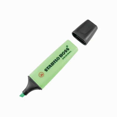
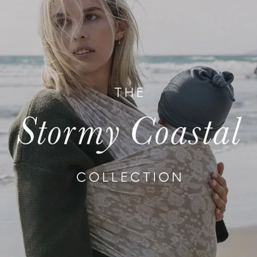
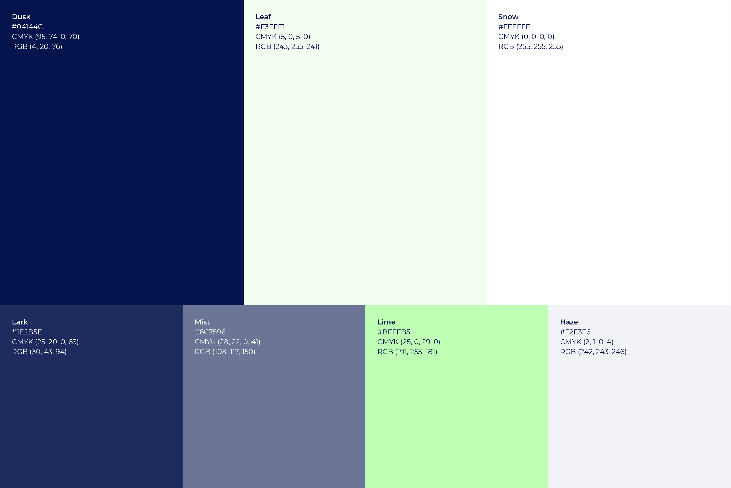
The concept drew on three key words from the brief: trusted, reliable, grounded. I contrasted a fresh pale green (symbolising land, growth and peace) with a rich dark blue (representing the sea, trust and authority) for visual impact.
Concept inspiration


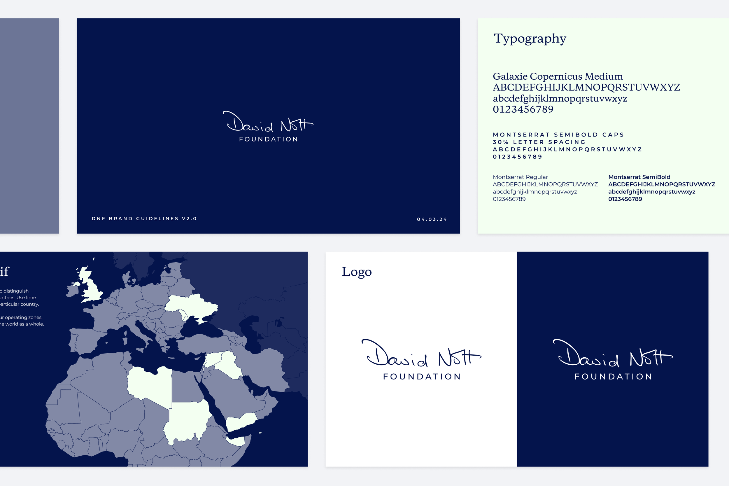
Typography
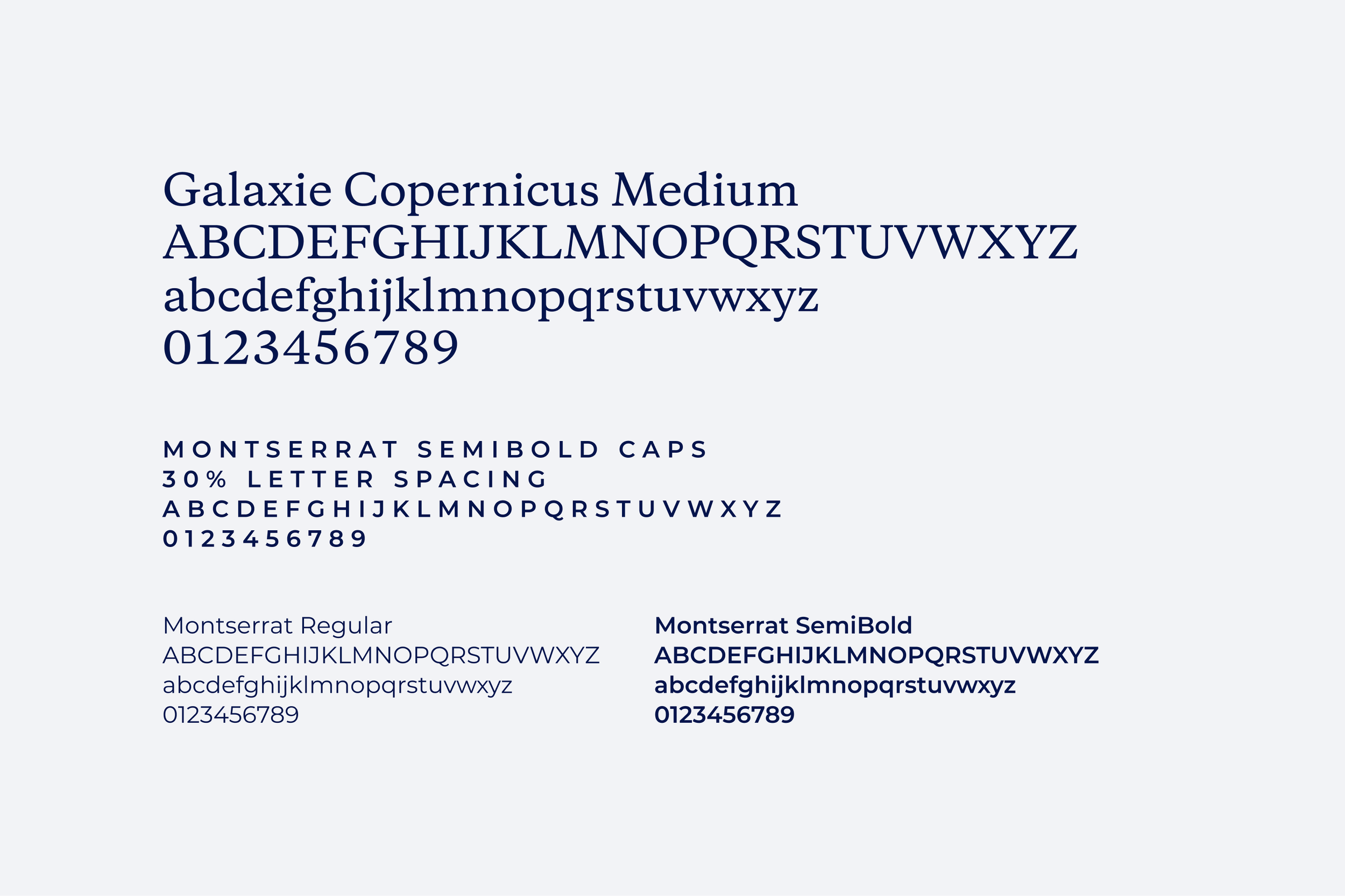
I paired Copernicus, a striking, bold font, with Montserrat, a clean, modern font that looks great in caps.
Logo
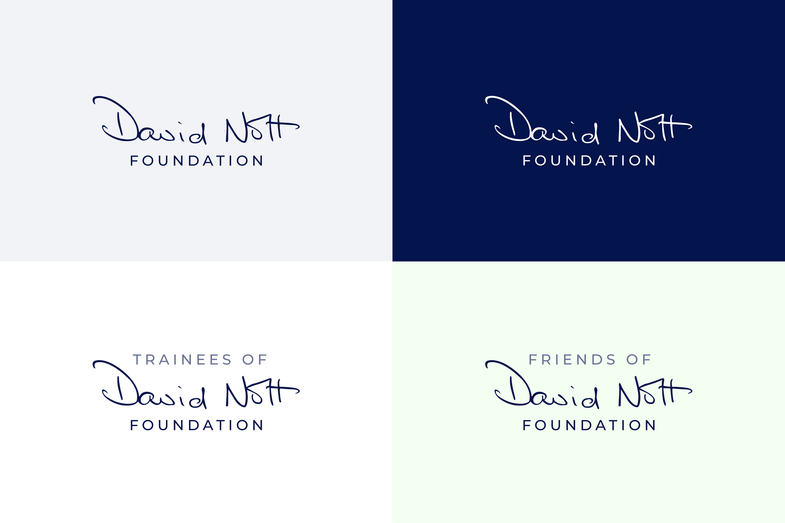
The Foundation wanted to keep the signature, so I centrally aligned ‘Foundation’ beneath it in the new typography.
Colour palette
Icons
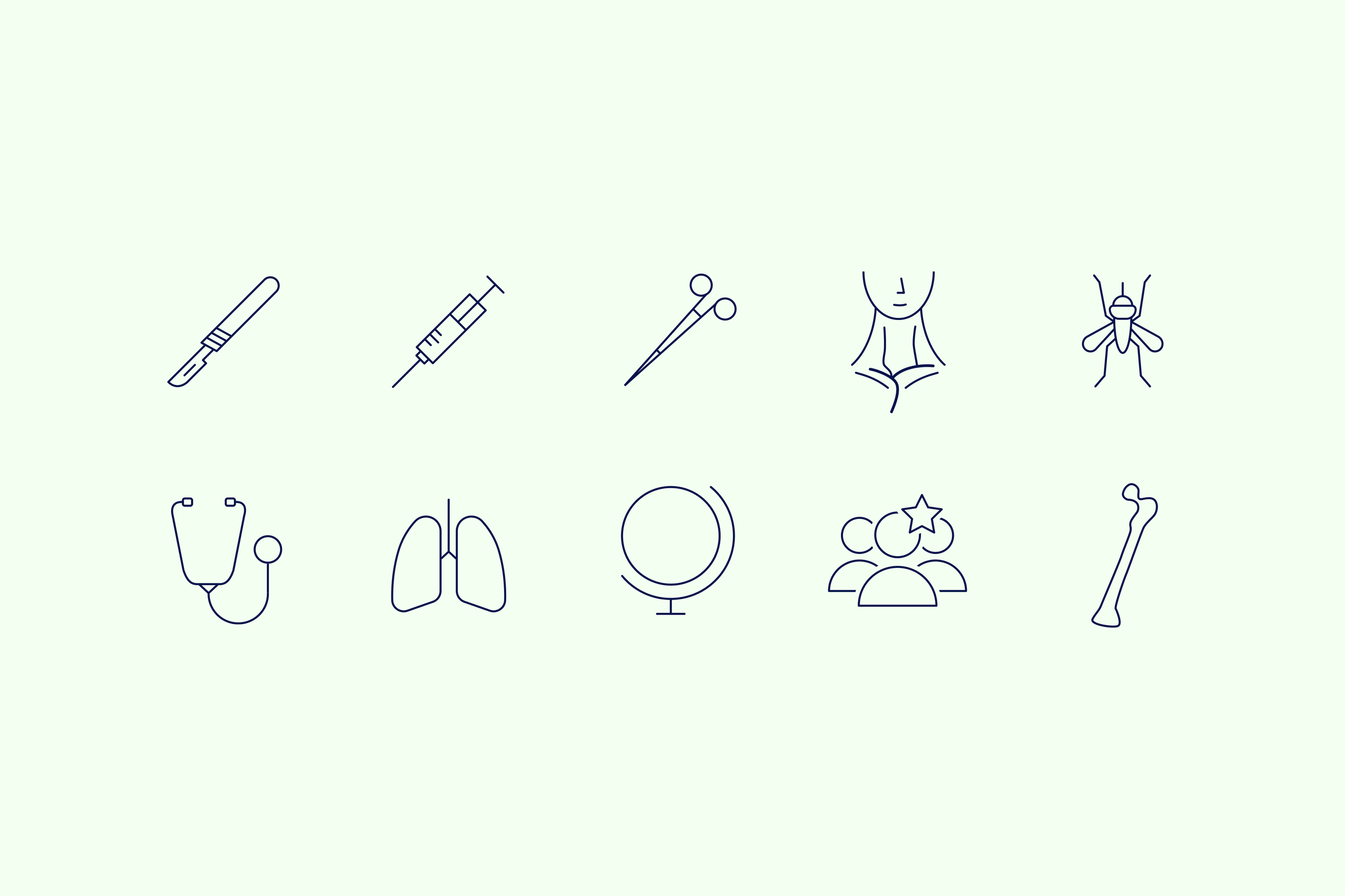
Icons for the website, emails and presentations. A selection of my favourites is shown below.
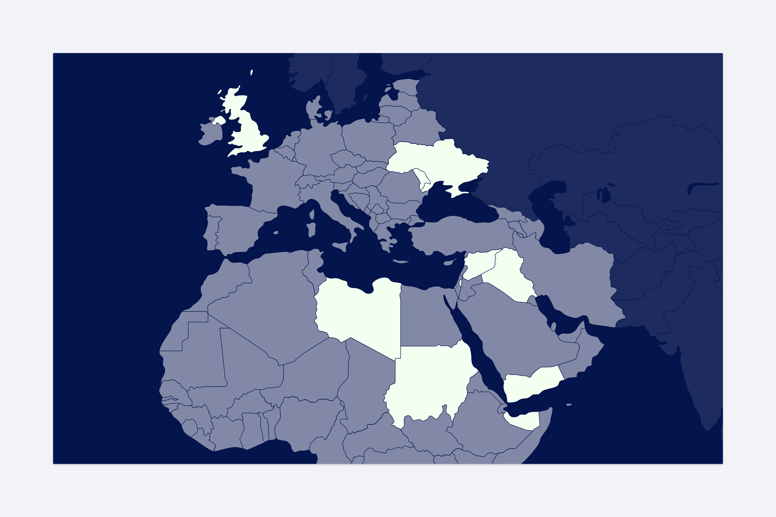
Map motif
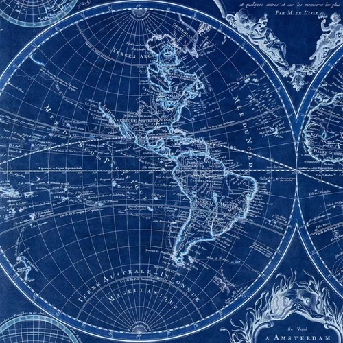
The map motif runs across all brand assets, with an interactive version on the Foundation’s website.
Brand toolkit
A brand toolkit to improve content consistency across the organisation.
Website designs
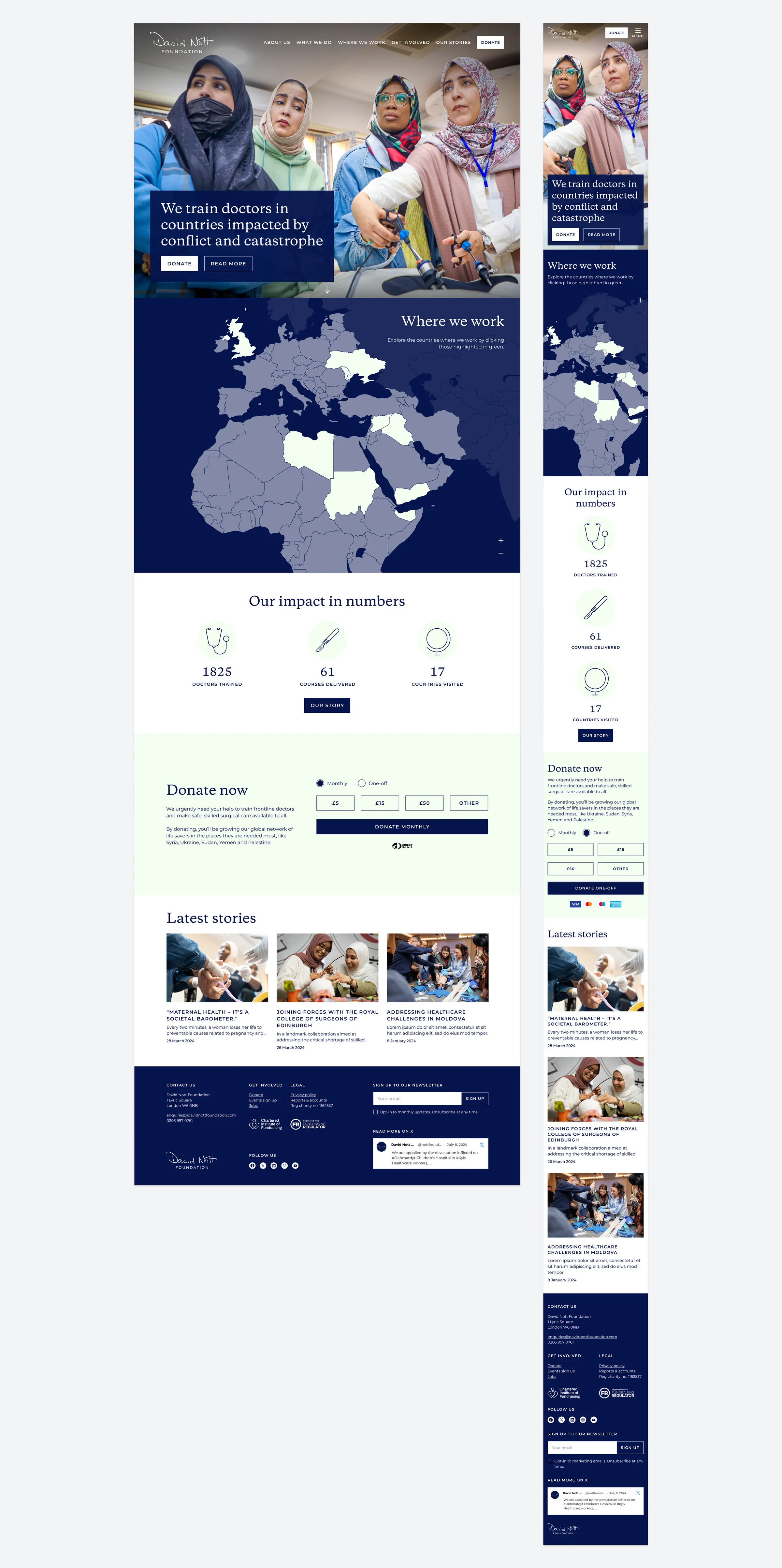
Key features include:
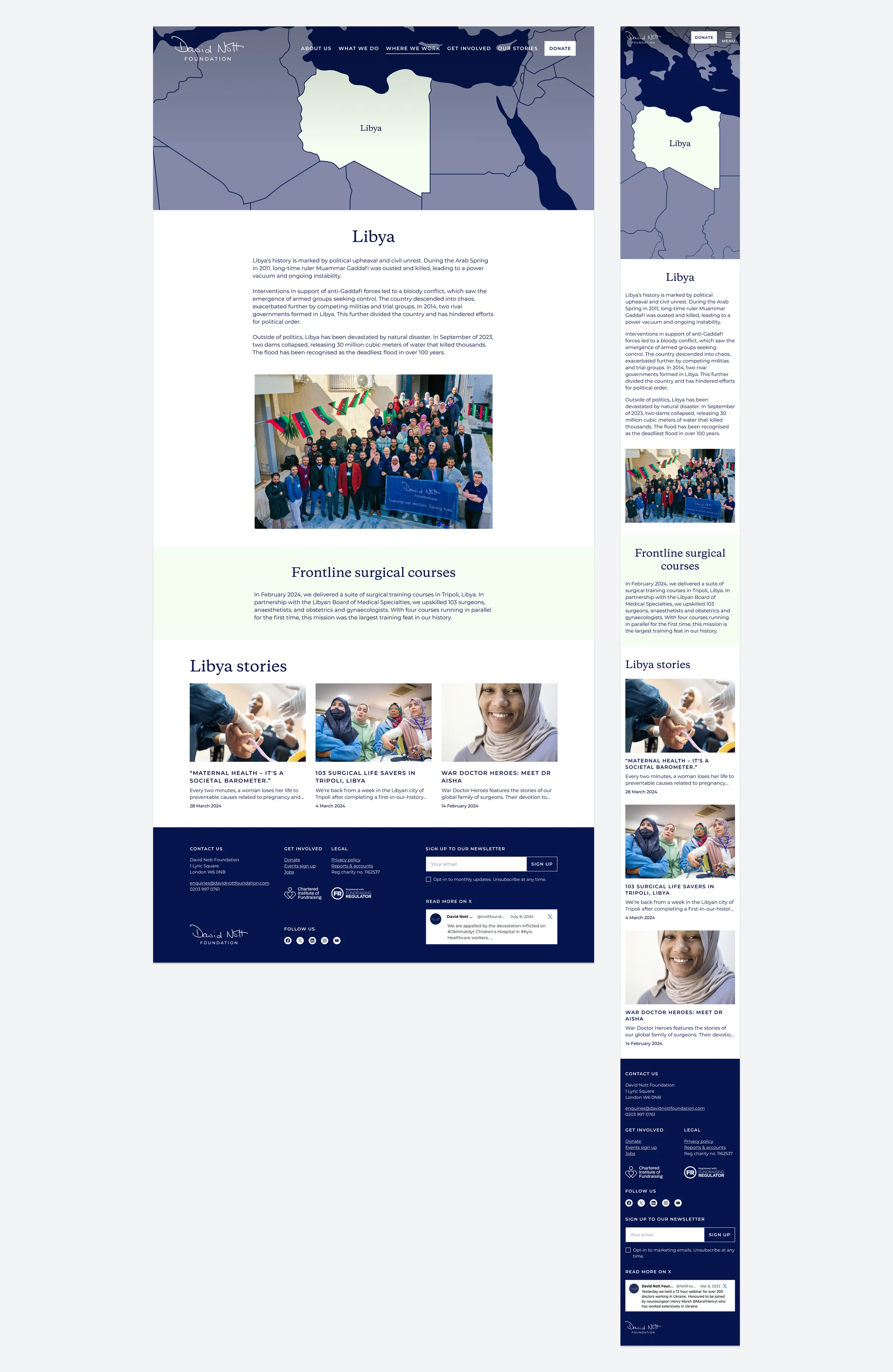
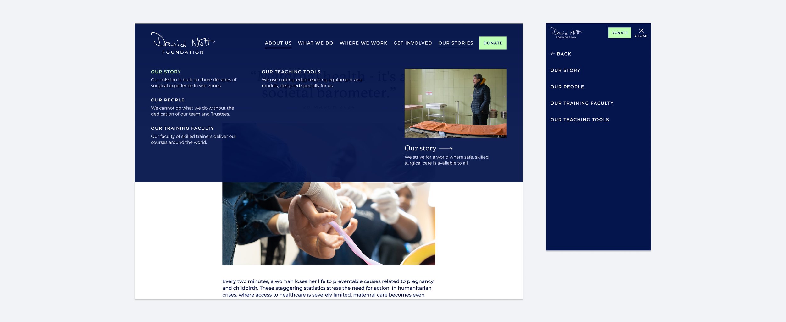
- A descriptive meganav for easy navigation
- An interactive map showing where the Foundation works, linking to further information and articles
- An interactive sliding scale showing the difference a donation could make
- Simple, engaging donation functionality
- A news area with articles and videos filterable by operating zone, country, course type and author
- Quick newsletter sign-up
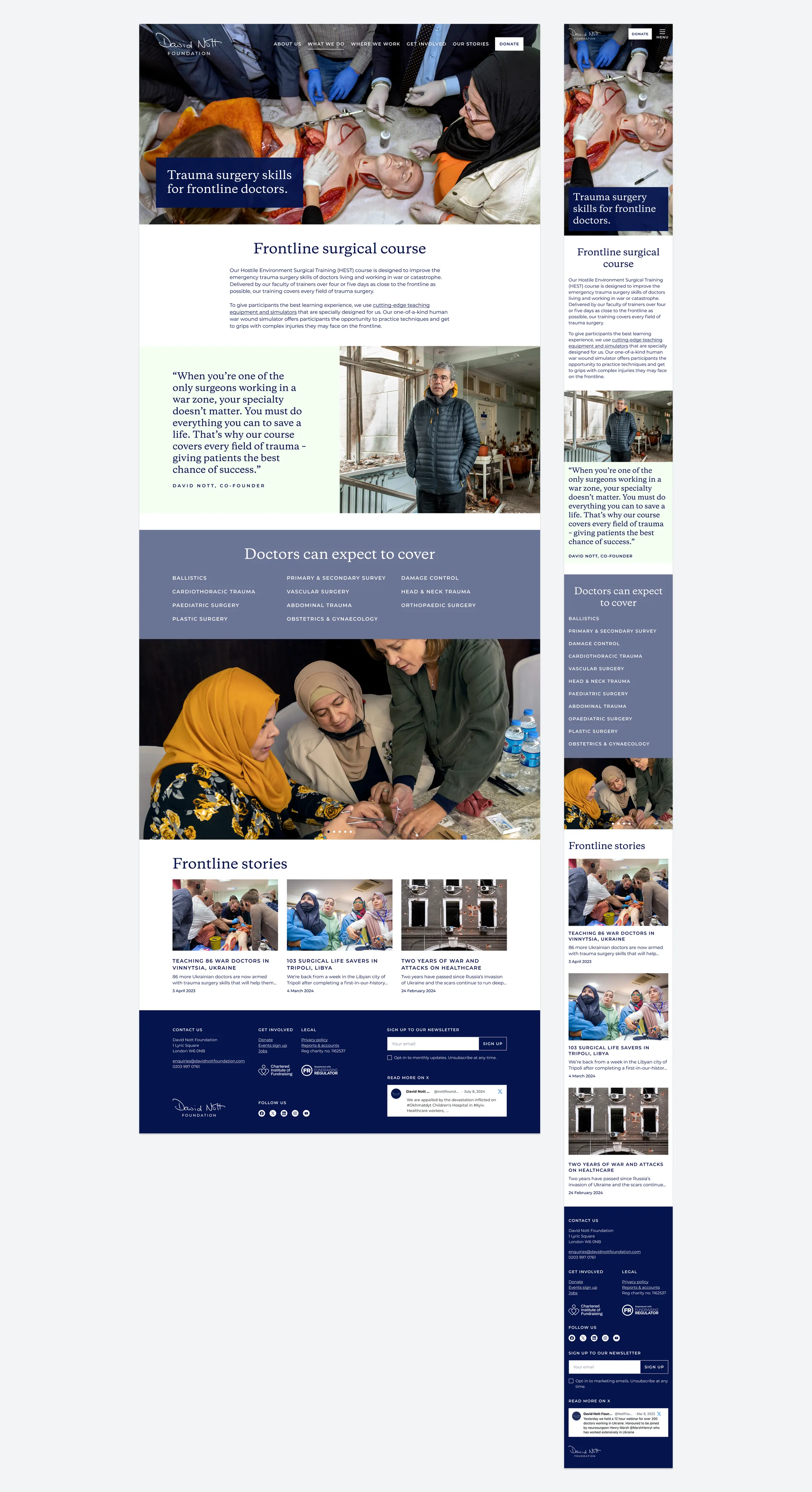
- A showcase of the Foundation’s cutting-edge teaching technology
- Map graphics for each operating country page
Homepage
Course page
Country page
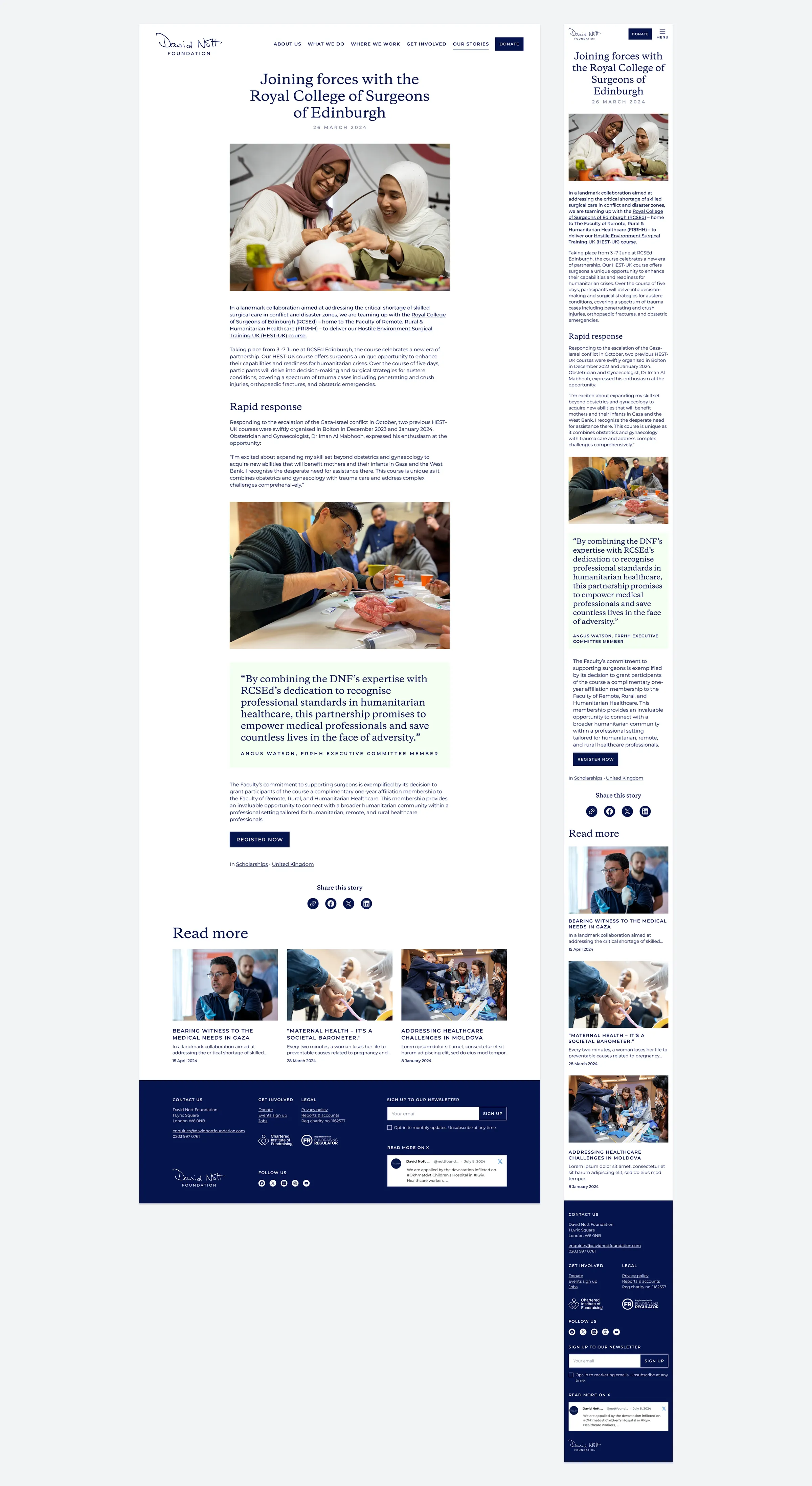
Article page
Meganav
Digital design
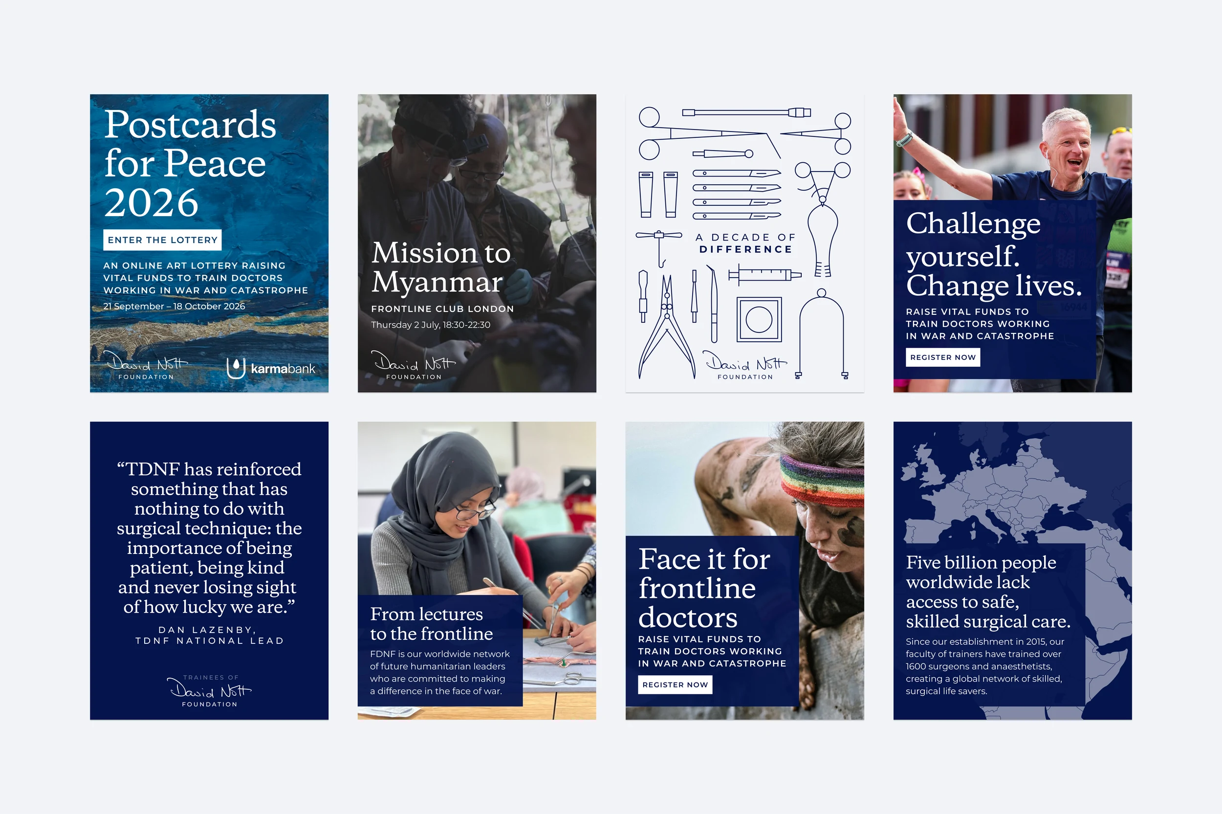
Social media
A social media library of editable, auto-layout templates in Figma.
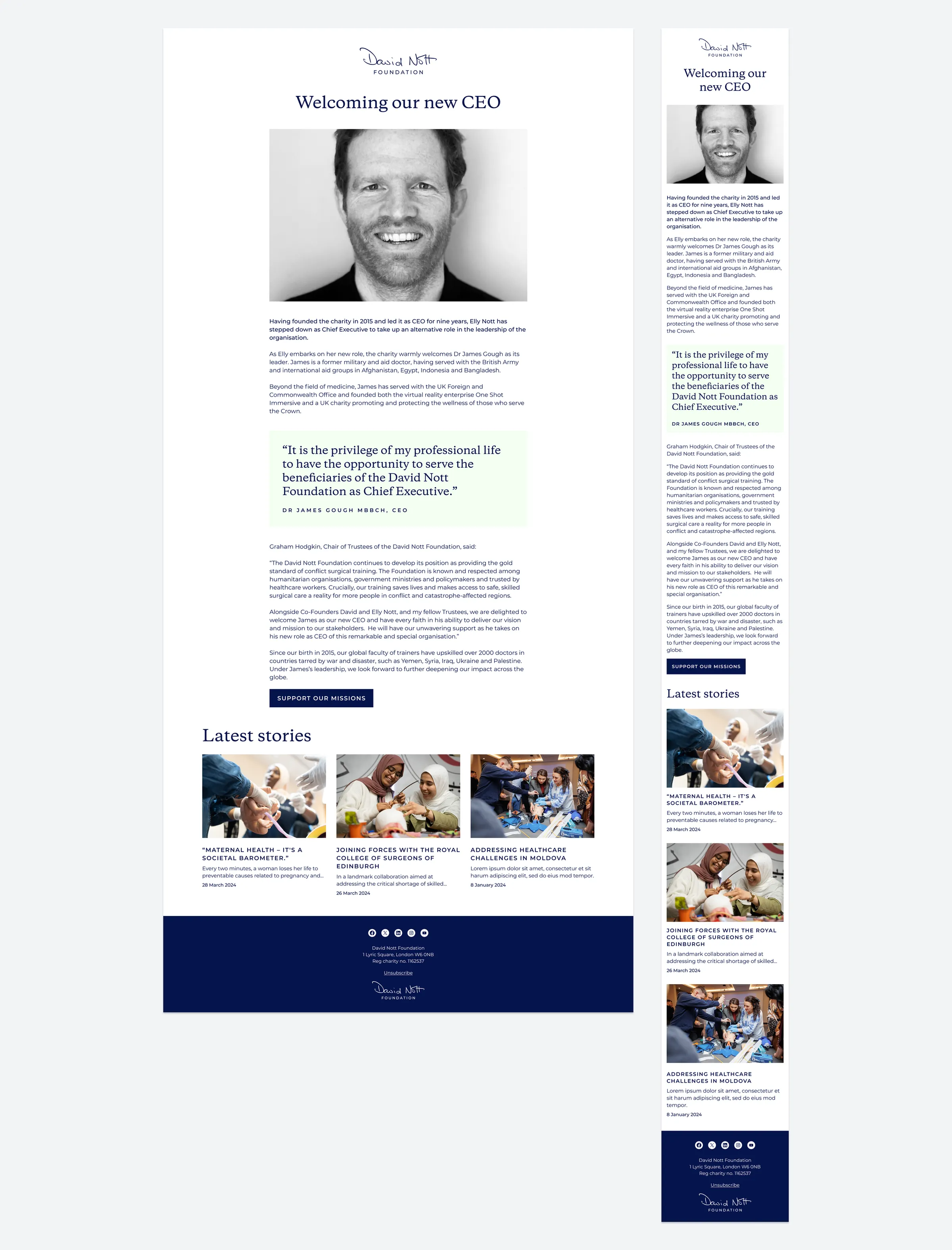
Email template
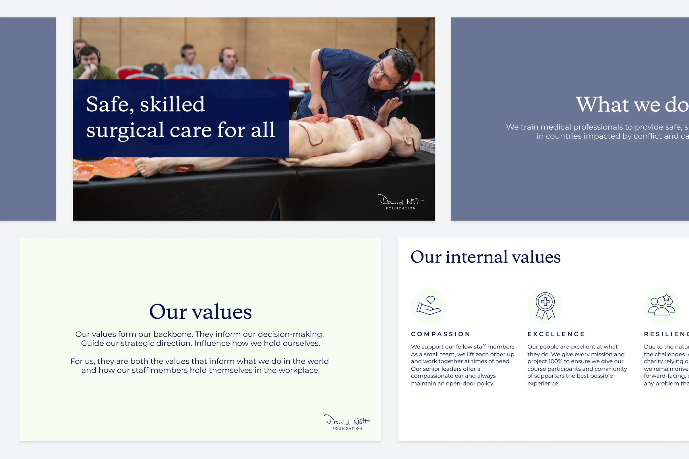
Slide deck
Print design
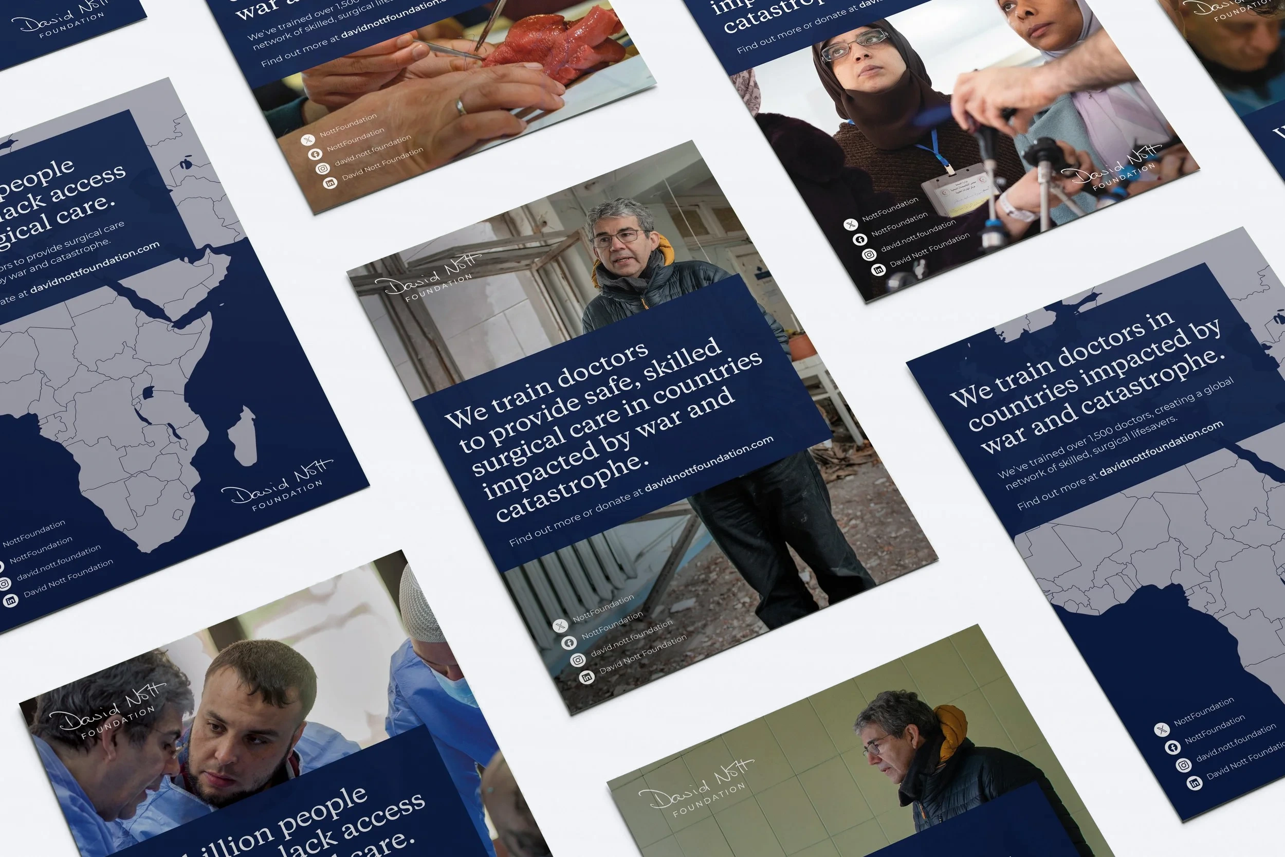
Posters
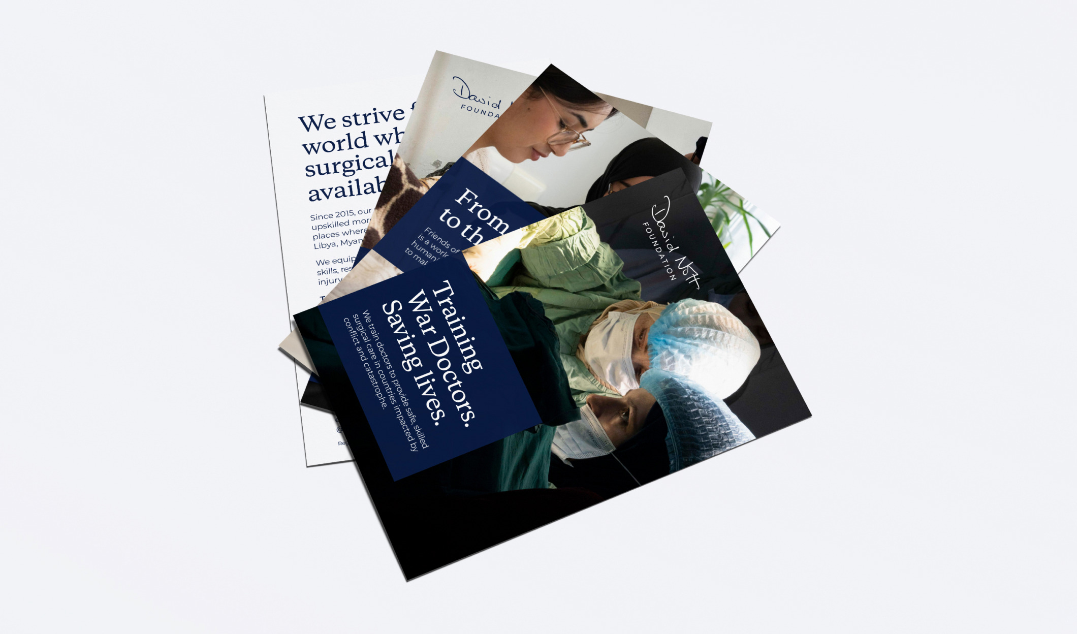
Flyers
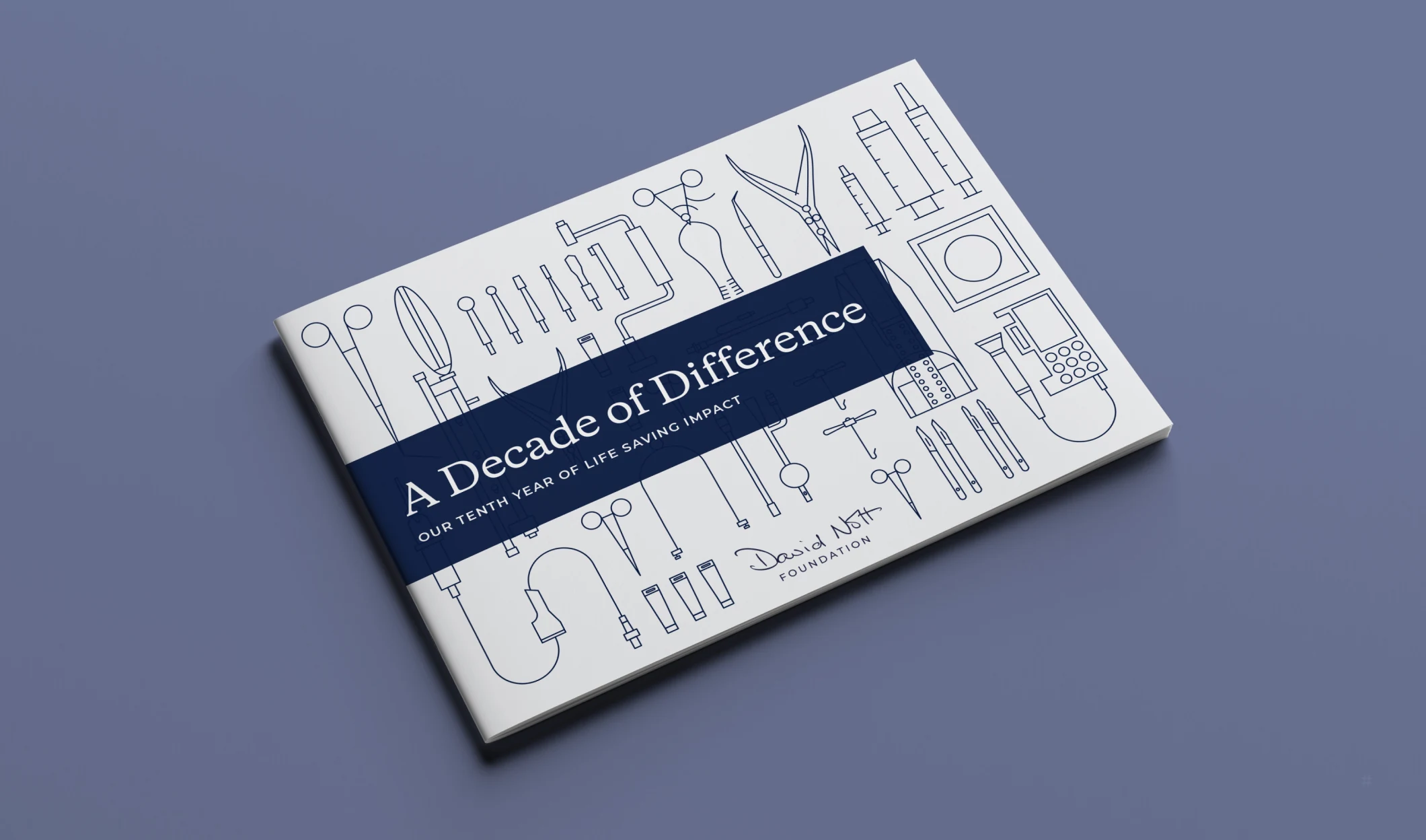
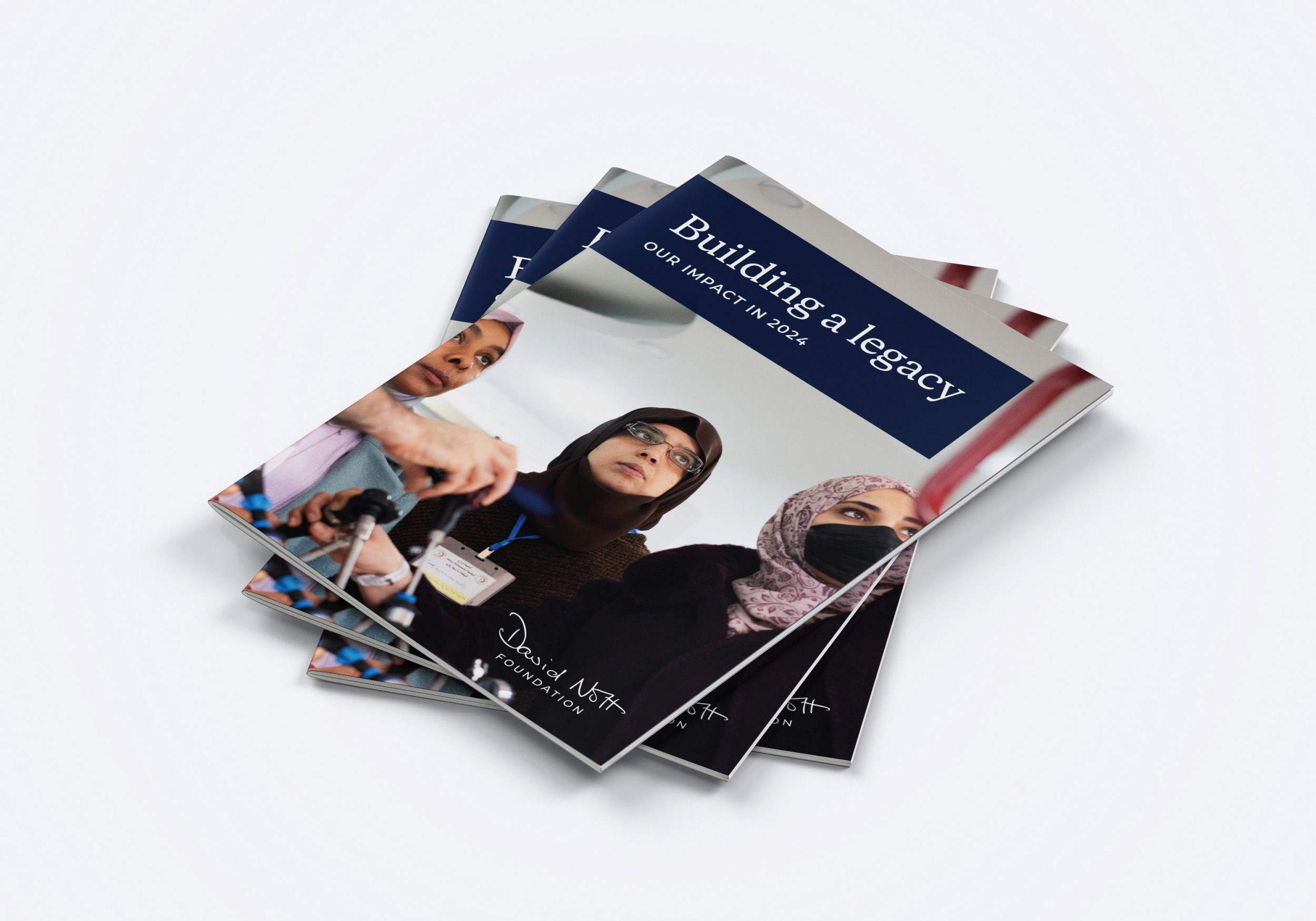
Impact reports
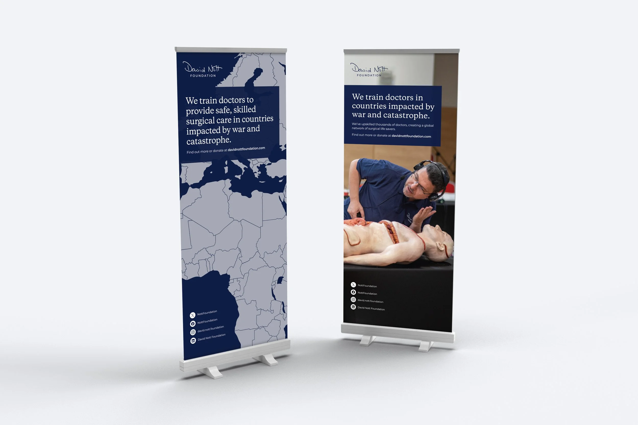
Pull-up banners
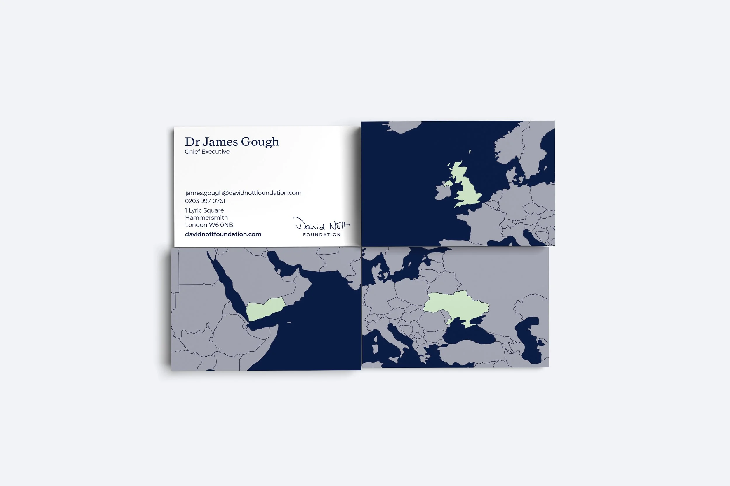
Business cards
Our map motif highlights the location of each staff member.
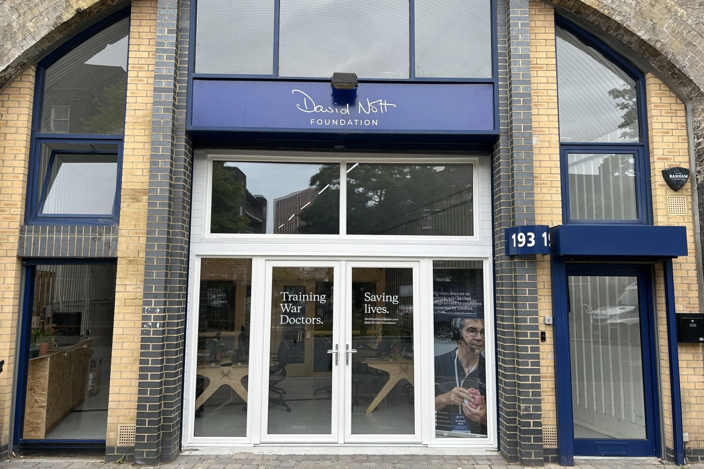
Office branding
Brand launch
I also supported the brand launch campaign, supplying a mood board of recent competitor campaigns; social media posts and stories for Instagram, Facebook, Twitter and LinkedIn; and storyboards and videos for ‘Our story’ and ‘Three pillars’.
I presented four campaign concepts, two of which we developed. I collaborated with Videographer Ollie Holder to bring the storyboards to life.
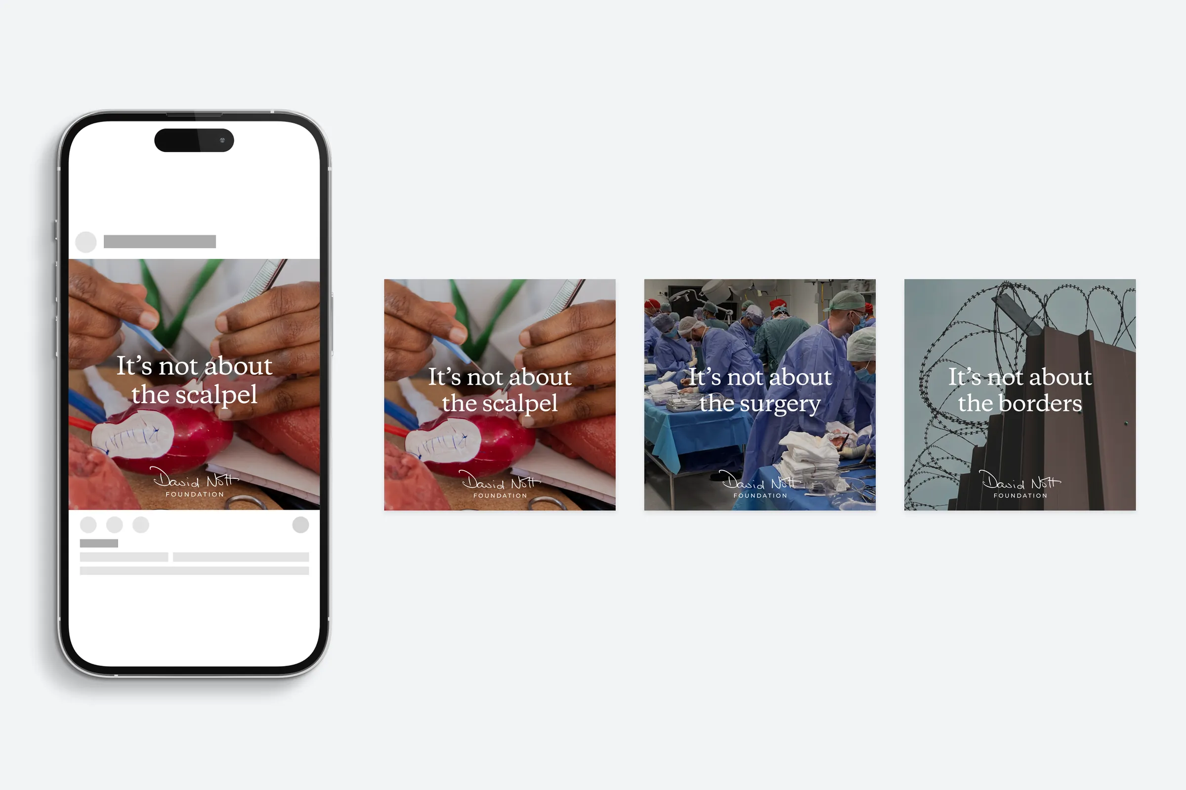
Concept 1: It’s not about…
Building on a quote by David Nott, this concept showcases the people whose lives are helped and saved by the charity.
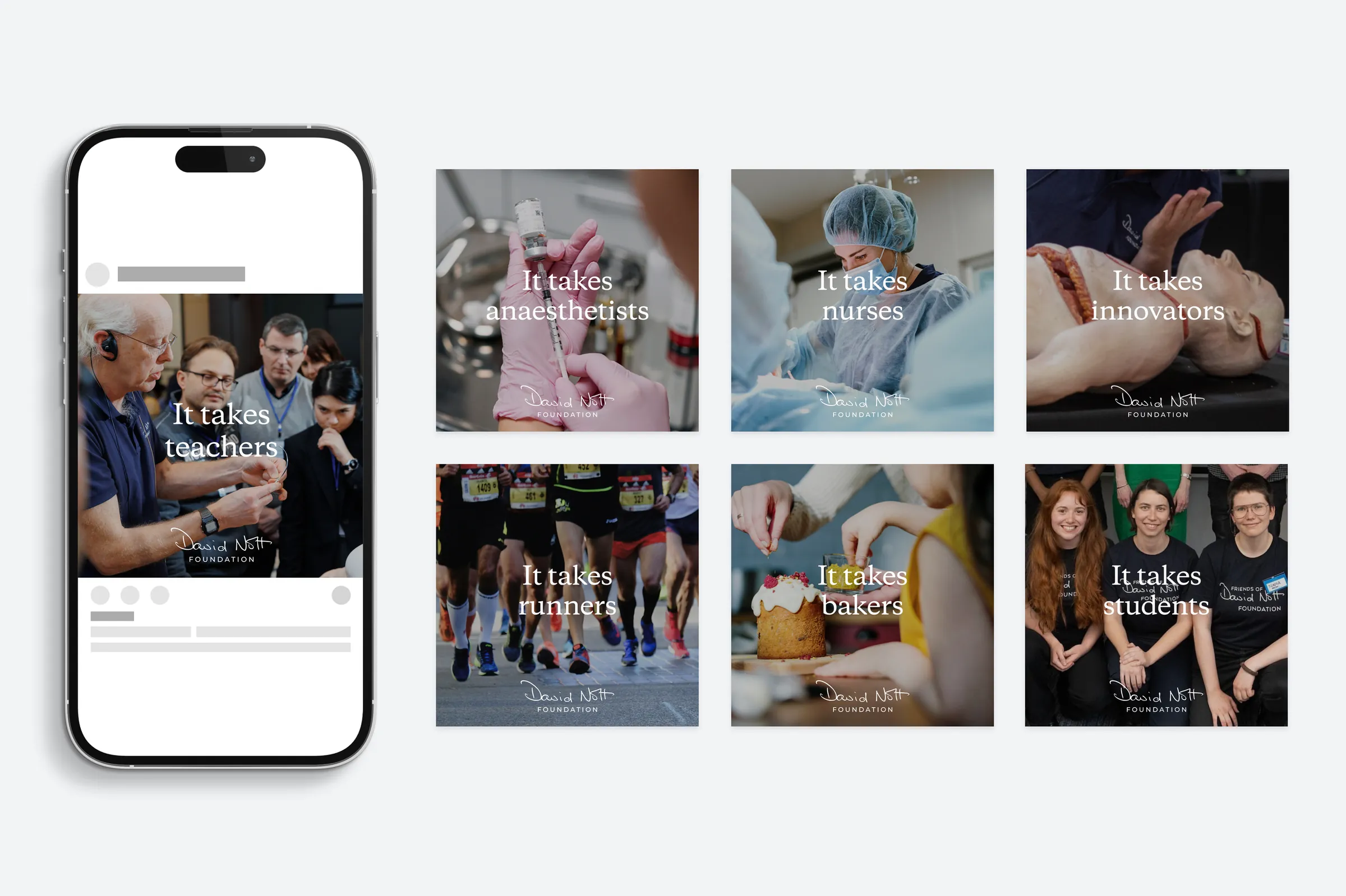
Concept 2: What it takes
Inspired by the people behind the Foundation, this concept is built on the charity’s three pillars: building capability, building community and building awareness.
Testimonials
Deborah has transformed our brand, evolving it sensitively but courageously to ensure it aligns to our culture, values and core product.James, CEO of the David Nott Foundation
Deborah is so fast, picks up concepts and generates fresh ideas in a heartbeat, and brings 110% to every project. She's meticulous for detail too – which serves my OCD very well!Christie, Head of Communications at the David Nott Foundation
We can have the beginnings of a messy and creative idea and within a matter of hours, Deb organises and brands it, and it becomes ‘something’. Something strong, recognisable and trusted. We’re proud to have Deb in our team.Lucy, Director of Communications at the David Nott Foundation
I was immediately impressed by the quality and polish of Deborah’s designs. She’s a lovely person to collaborate with, always approachable and pleasant.Remah, Programmes Officer at the David Nott Foundation
It’s really special to see the marvellous work of the Foundation come to life with your design brilliance, thank you.Elly, Co-Founder of the David Nott Foundation