Making health publications more accessible for heart patients and healthcare professionals.
Background
The British Heart Foundation offers a wide range of publications – from booklets on specific conditions to guides on healthy living – that people and healthcare professionals can order for free. But the existing search, basket and checkout journey for ordering these publications had grown outdated and difficult to use.
As part of a wider website redesign, this end-to-end journey needed to be rebuilt to make it easier for people to find, order and receive the right publications.
Brief
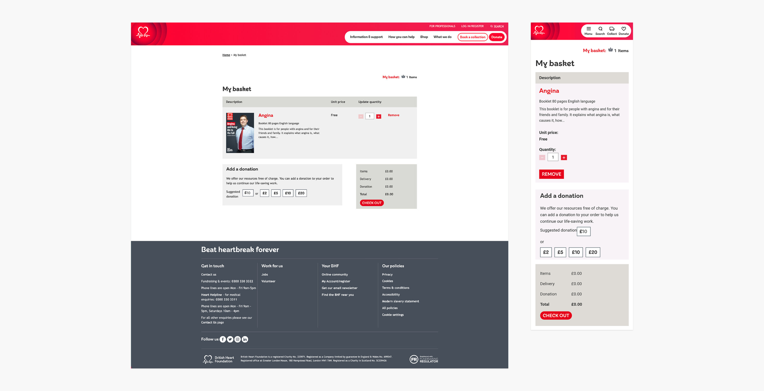
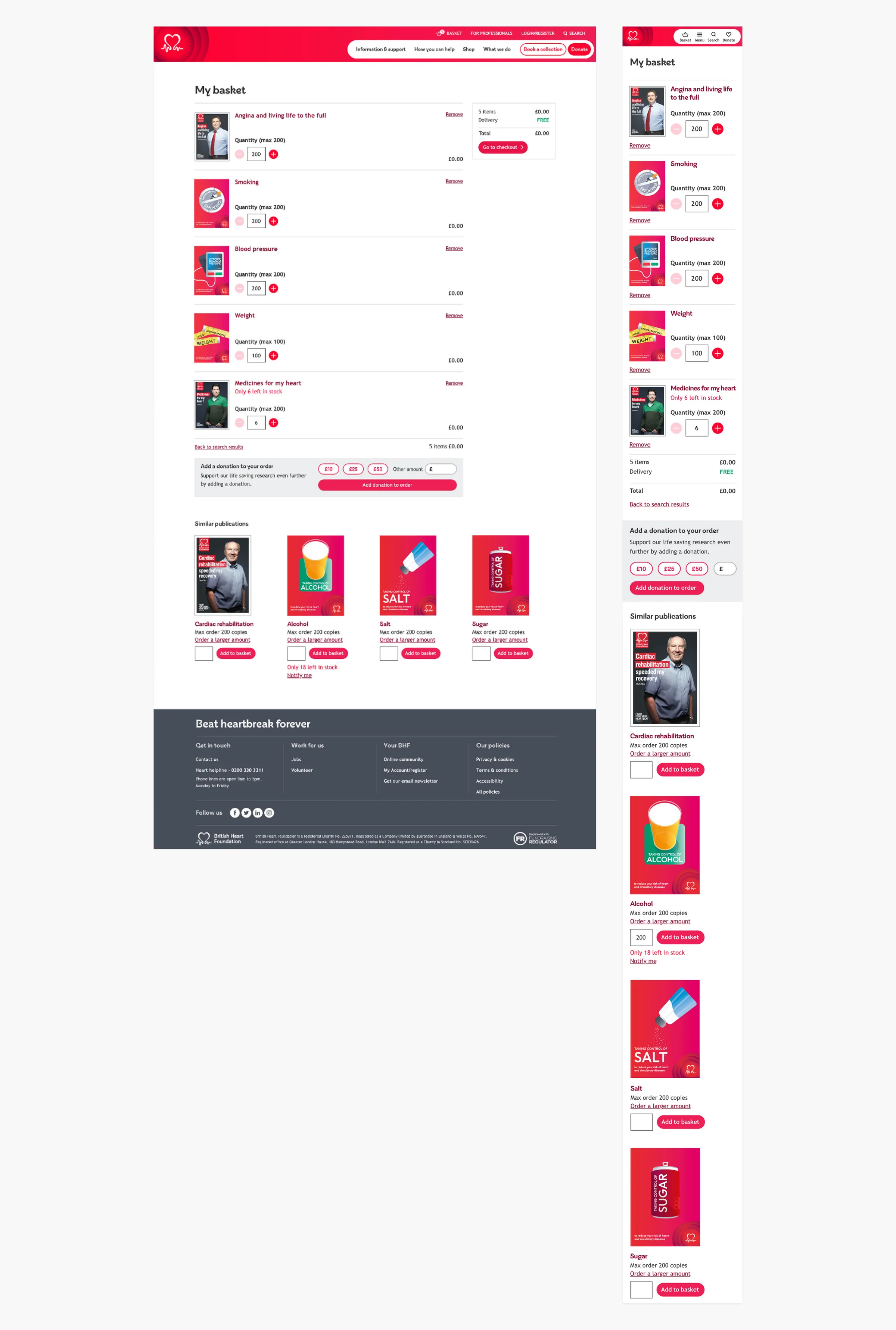
To redesign a new and improved end-to-end publications journey on the British Heart Foundation website including a basket in the header, search filtering functionality and search results, publications pages, adding/editing/removing items and donations in a basket, maximum quantity and low stock level messaging, and proceeding to checkout.
Research
Personas
Eight personas, representing the main British Heart Foundation audiences, were created in collaboration with Sift Digital. The personas below are our main focus for this project.
Healthcare professional

- Name: Ana
- Age: 28
- Job: Cardiac Nurse
- Location: London
- BHF familiarity: High
“I always want to help, but there’s so little time. I need support.”
Situation
Ana works long hours as a nurse in a busy hospital and recently specialised in cardiac nursing. Her biggest problem is time – understanding each patient’s situation properly is a luxury she rarely has.
Top tasks
When a patient reports a rare side effect, Ana suggests they search for it plus ‘BHF’ at home. For questions about controversial new treatments, she searches on her mobile for a BHF position statement.
Person with CVD
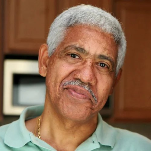
- Name: Tony
- Age: 64
- Job: Retired
- Location: Chelmsford
- BHF familiarity: Medium/high
“I know the British Heart Foundation are there for people like me, but I’m not sure of everything they do.”
Situation
Tony was hospitalised with a racing heartbeat and had a catheter ablation. His diagnosis came as a surprise, having never smoked and stayed physically active, so he turned to the internet to learn about the condition and lifestyle changes.
Top tasks
Tony searches ‘arrhythmia’ online across the NHS, BHF, Wikipedia and WebMD, then looks up his medication on the BHF website and prints a page on side effects for his GP.
Family member

- Name: Russell
- Age: 47
- Job: Surveyor
- Location: Coventry
- BHF familiarity: Medium
“I need help for my dad now, but I’m also worried about my children and me.”
Situation
Russell’s dad had a heart attack a couple of months ago. He was given BHF leaflets at hospital and told the BHF could help with ongoing health advice.
Top tasks
Russell searches ‘healthy eating heart condition’ to help his dad eat better, and reads about risk factors on the BHF website, wondering if the condition is genetic.
User goals
- To clearly navigate to relevant publications
- To be presented with similar publications that may be useful to them
- To easily download publications and order physical copies through basket functionality
- To be informed when publications are low in stock or out of stock
- To be informed of the maximum order quantity and to be able to order more if required
- To easily access the basket when navigating the entire website
The top three pain points
A disappearing basket
Currently the basket only appears in the publications area of the website which leads to a disjointed journey if this area is left temporarily.
Unclear maximum order quantities
To get around maximum order quantities, users are cheating the system by placing multiple orders – a frustrating and expensive process.
Lack of information surrounding stock levels
Stock level information is not shown and users are confusingly placing orders on stock that isn’t available.
Website template migration
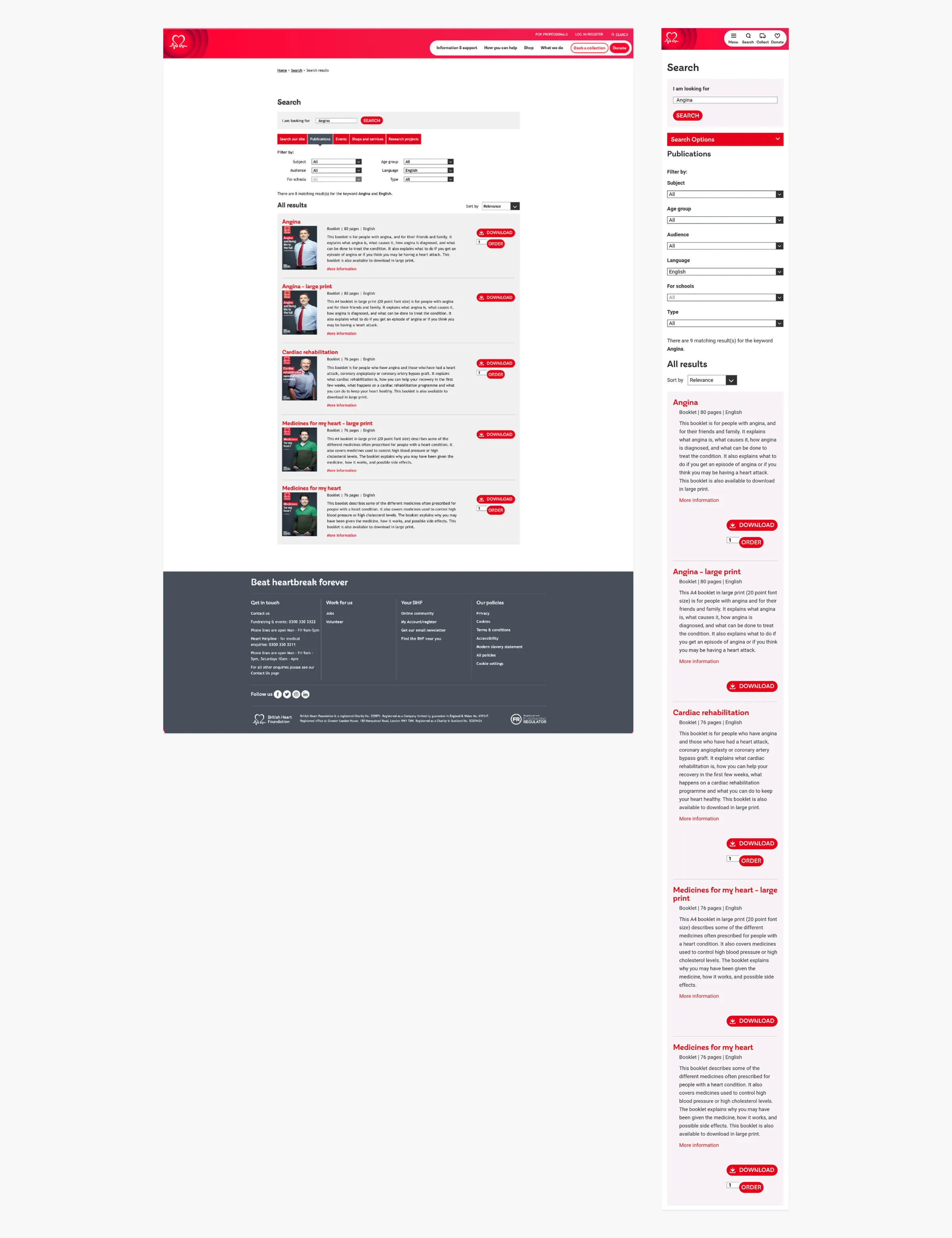
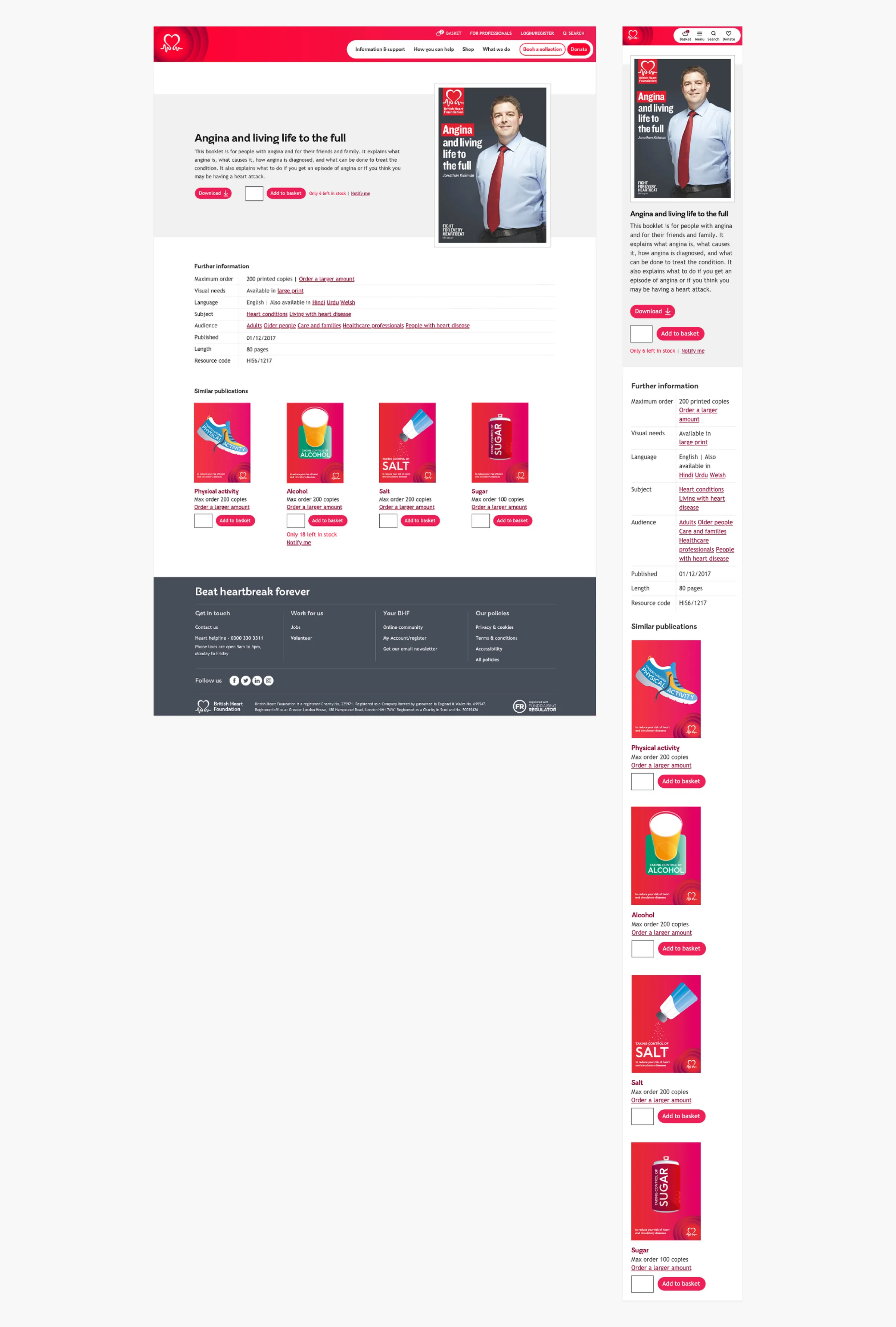
The existing search and publications journeys were built in the website’s legacy template and needed to be migrated to the new template. The legacy template was primarily designed for desktop, and the layout appeared muddled on mobile – elements too closely arranged, unoptimised font sizes, and no supporting images in search results.
Competitor analysis
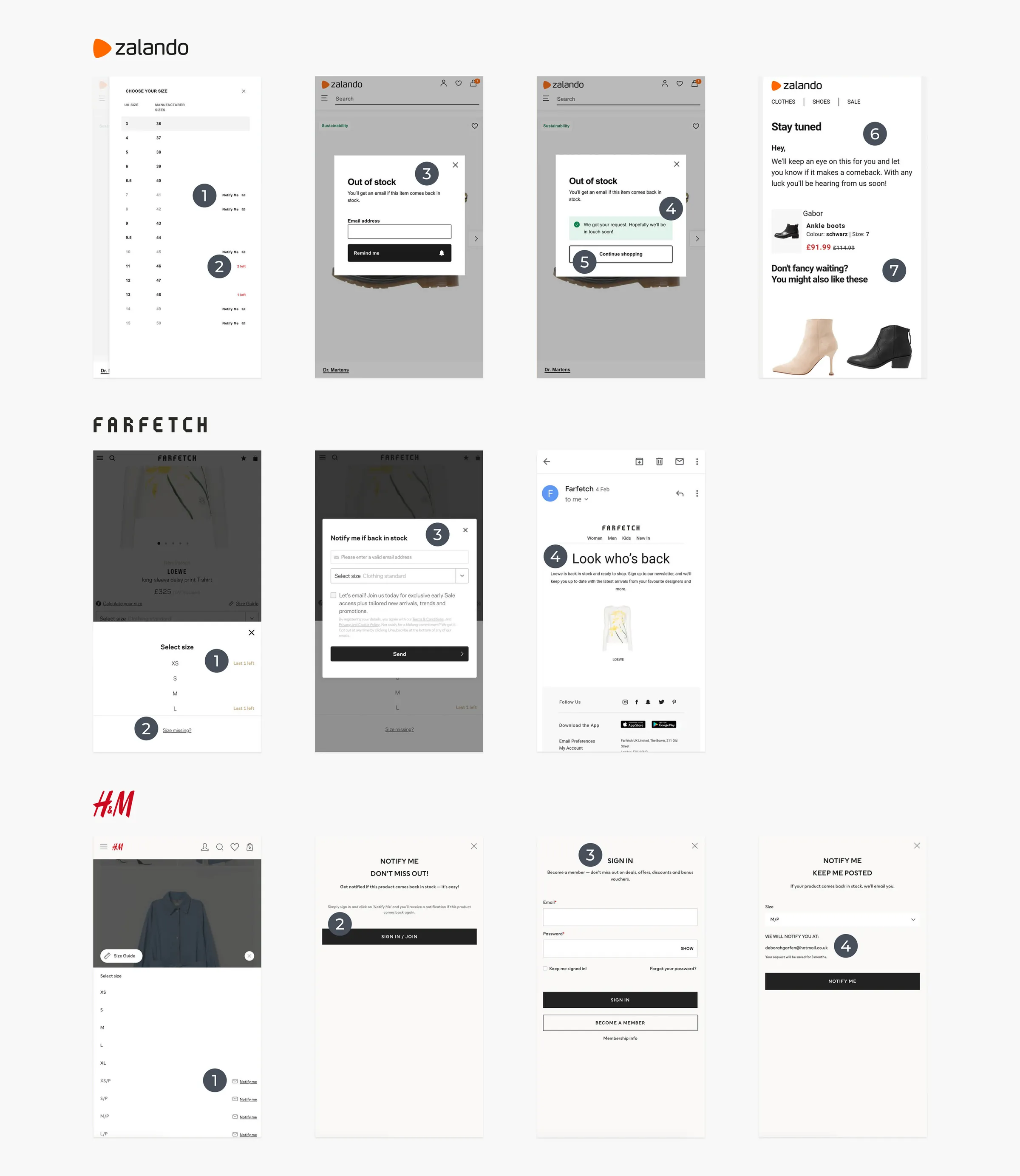
I used Miro to collate and review various competitors’ basket journeys, focusing on adding items to basket, stock level messaging and notification functionality. These included Zalando, Farfetch and H&M.
Design & testing
Sketching
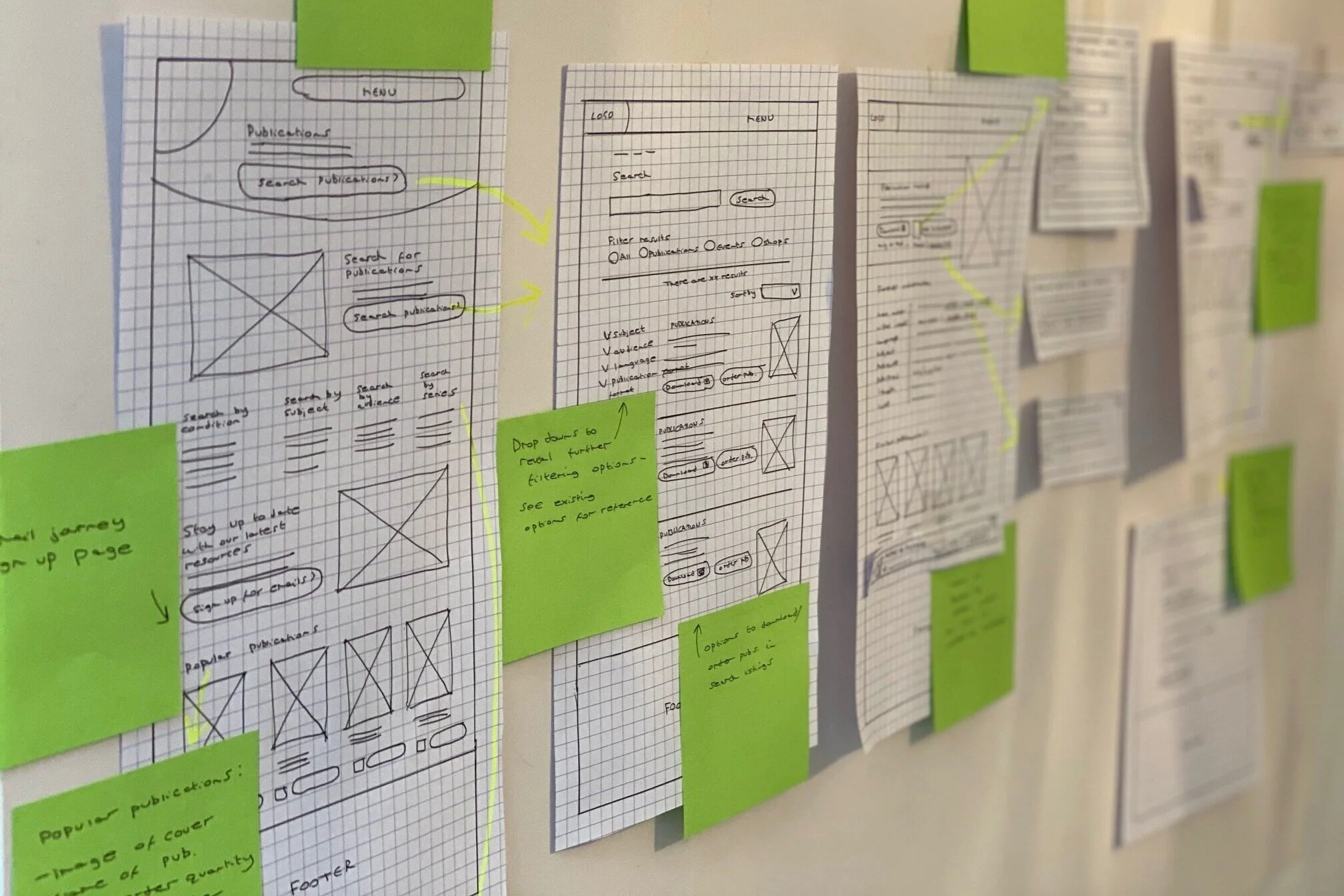
I then sketched out key user journeys, noting any areas that required further investigation. The sketches were used to inform a working prototype created using Sketch and InVision.
Guerrilla testing
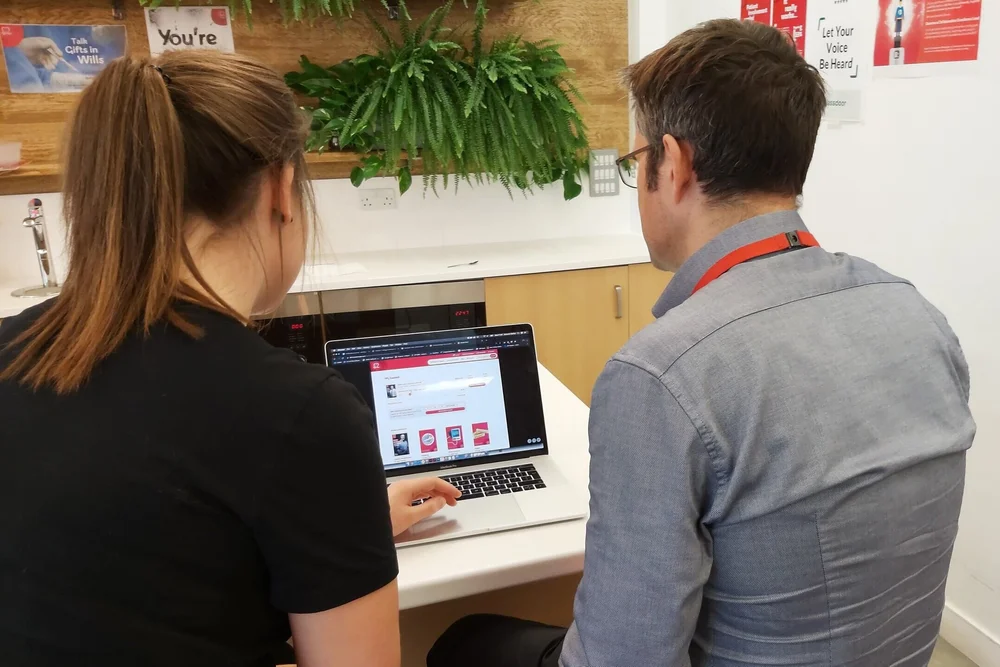
I carried out ten-minute guerrilla testing sessions with ten colleagues from across the business using an InVision prototype covering the basket, stock levels, maximum order and basket-in-header journeys. Generally they found the process easy to use, but I noted down feedback and any indication of struggle.

Affinity mapping
I mapped the key findings from the guerrilla testing sessions and clear themes emerged, including emphasising the maximum order information, giving ‘Back to search results’ more prominence, and referencing stock quantity on the ‘Notify me’ modal for clarity. I then revised the prototype designs accordingly.
User interview and usability testing
The interview was made up of a run-through of how the healthcare professional normally orders BHF publications, plus usability testing sessions on the publications prototype and the redesigned search pages.
Part 1: Bio, behaviours and frustrations
- Name: Yvonne
- Location: London
- Hospital: St George’s
- Department: Coronary Care Unit (CCU)
“We give patients physical copies of the publications because we don’t think they will download them. We’re trying to make sure they don’t come back again.”
Behaviours
Yvonne assembles her own information packs for adult heart patients, ordering five BHF publications in bulk plus a self-printed advice sheet. Nurses prefer physical copies since they’re easy to run through before patients leave hospital, and many aren’t confident downloading copies online.
Frustrations
- A lot of back and forth between the ‘my account’ area and the basket
- She doesn’t need to see all the intro copy when re-ordering – “I know what I want and I just want to order it”
- The ‘my account’ order list is long and unhelpful, listing repeated publications
Part 2 & 3: Testing findings
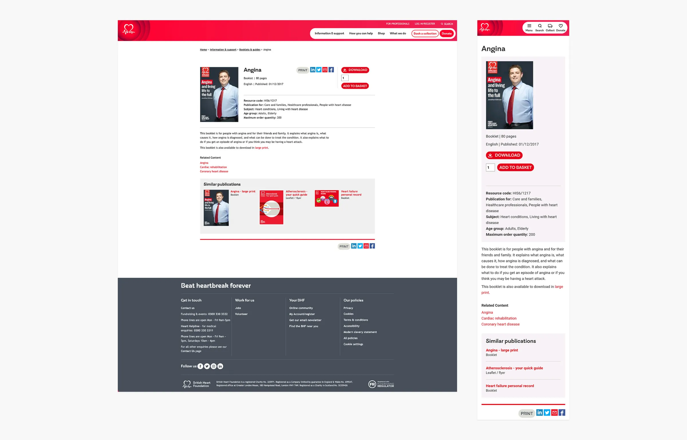
She liked that ‘large print’ was clear within the publication title and that similar publications were offered at the bottom of the page. ‘Maximum order quantity’ information went unnoticed, and it took her some time to find the basket in the header as she expected it “like other sites”, in the far right corner. On the search pages, she found the filtering system easy to navigate, with no trouble using radio buttons and checkboxes.
Recommendations
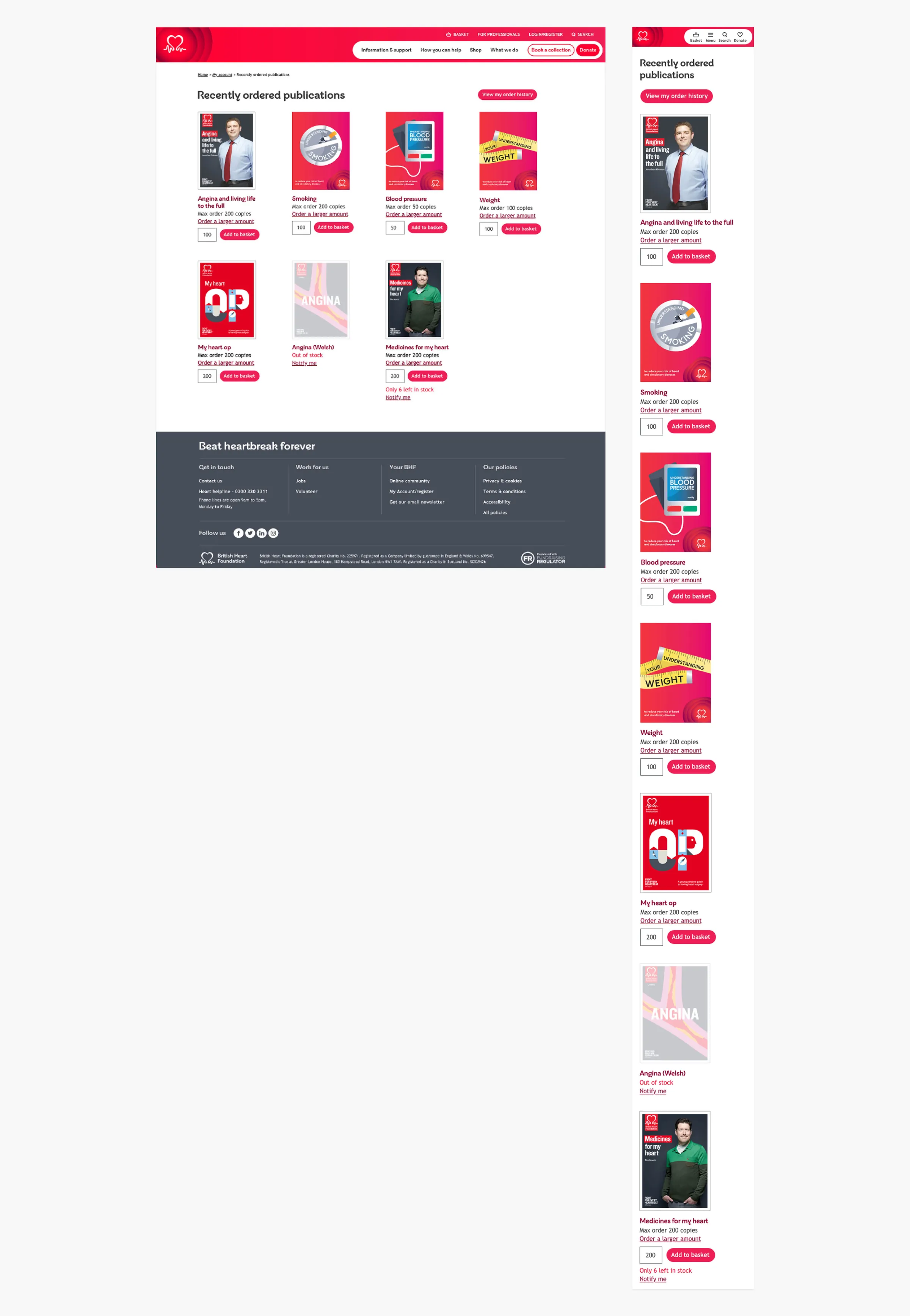
Based on feedback, the proposed ‘My account’ publications area for healthcare professionals includes recently ordered publications listed once (rather than once per order), an ‘Add to basket’ button with the previous quantity pre-filled, a link to order history, and clear stock level and maximum order quantity information.
Website designs
Testimonials
Deborah is a joy to work with! She is an extremely talented designer with a natural user focus. I was lucky to have her join my Product team; she immediately added value.Katie, Digital Product Manager at the British Heart Foundation

I loved working with Deborah! She’s incredibly proactive, thorough and a team player with outstanding user-centred design skills.Emilia, Brand Manager at the British Heart Foundation
I’ve worked with Deborah for ten years and can confidently say she’s one of the best. She takes the time to understand a brand’s visual identity and develop content that is consistent, accessible and effective.Kimberley, Brand Manager at the British Heart Foundation